Visual
Product typography
Typography guidelines ensure that we provide a consistent visual hierarchy that maximizes legibility throughout all of our written content.
Typefaces
While our brand typeface is Proxima Nova, our web and mobile apps utilize system font families to provide our users with an experience that is performant and optimized for their device.
Type tool
40026px1.48@include Typography-size--400;$Typography-weight--boldTYPOGRAPHY_SIZE_400TYPOGRAPHY_WEIGHT_BOLD--typography-size--400--typography-weight--bold<Text fontSize={400} fontWeight='bold' />Line heights are calculated to ensure at least three lines align to an 8px grid. Please use only the associated line height values.
Type weights
| Weight | Use |
|---|---|
| Reserved for headlines and buttons | |
| Reserved for and | |
| Reserved for body copy and subtexts |
Type styles
When working with different type styles it’s important to adhere to the type scale at all times. Below are some standards for the web we’ve defined to help you get started using the correct sizes for your content.
Headlines
Headline
Headline is the largest text on the screen, reserved for short, important text or numerals.
This is a Headline
Subheadline
Subheadline is smaller than Headline. Subheadlines are reserved for short text that is slightly less important than a Headline.
This is a Subheadline
Small Subheadline
- Small Subheadline is smaller than Headline and Subheadline. Small Subheadline is reserved for short text that is the lowest level headline.
- Typically used for labels or the lowest level of emphasis.
This is a Small Subheadline
Body copy
Typically used for long-form writing as it works well for small text sizes.
- In our application, we are defining long-form as any copy that’s a phrase or longer.
- Typically used for paragraphs, descriptive text.
- Line lengths of around 10 - 15 words.
Subtexts
Descriptive details that support a more important element. Rarely, if ever used alone.
- Includes our smallest font sizes. Often subdued and very low emphasis.
- Typically used sparingly as a byline to supplement a headline or summarize author, date, time, etc.
Color
Please see our color documentation for guidance on using type with color.
Specimen
This type specimen showcases real-world combinations of the different type sizes. You might see type used like this in cards or even message bubbles.
Type setting
When type setting content, it’s imperative to proofread and spellcheck everything. For more information, please read the full writing guidelines.
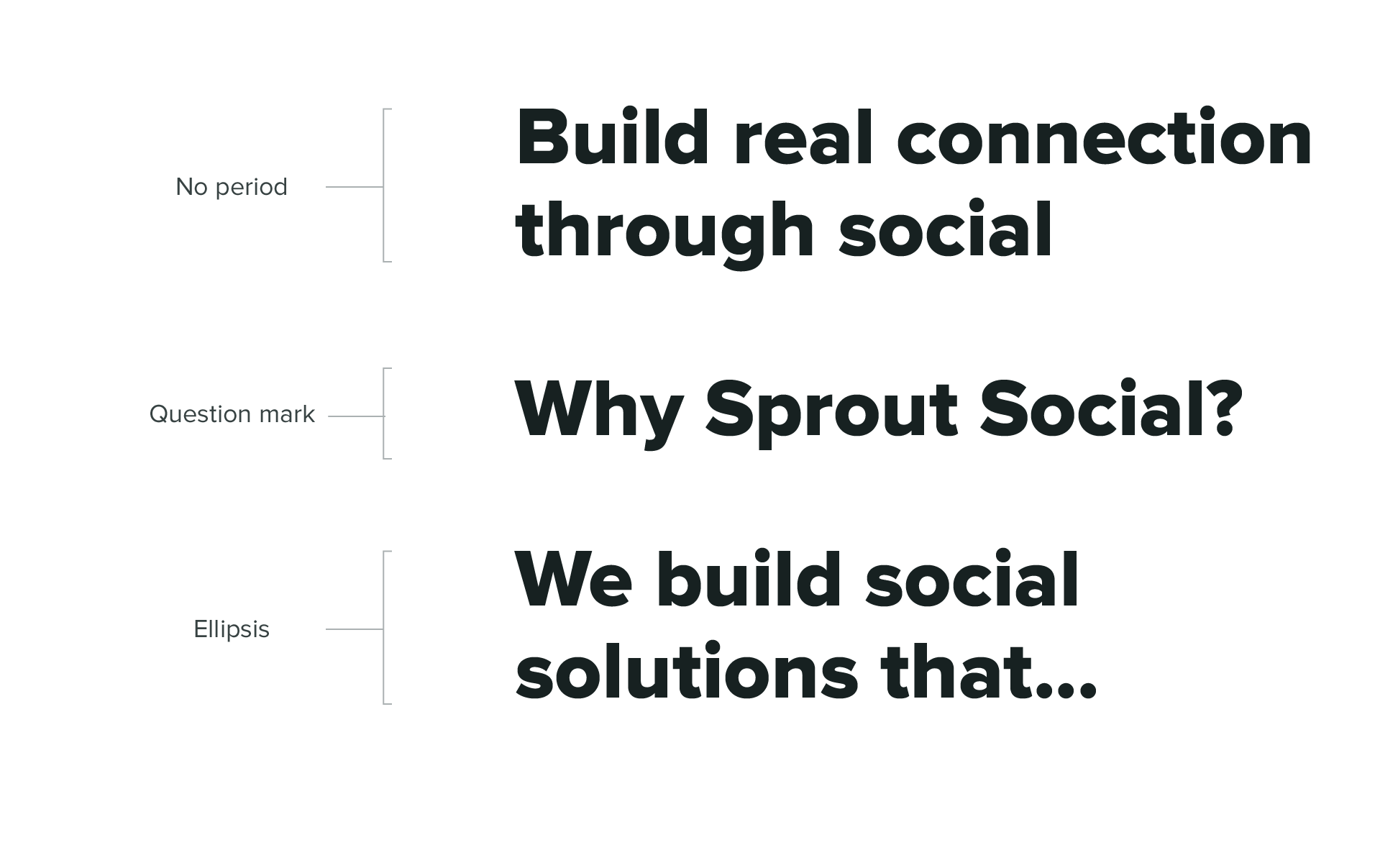
Sentence case
To feel more human and personal, all titles and headlines should be written in sentence case. Never use a period at the end of a title or headline. The only end punctuation used should be a question mark following a question, or an ellipsis if breaking up a sentence.