


Visual
Logo system
The Sprout Social logo system is comprised of a horizontal lockup, a wordmark and an icon.
Sprout is built on the idea that open communication creates progress. That belief is illustrated in our leaf icon in the form of upward movement and growth.
Primary Logos
Our primary marks are incredibly flexible and appropriate for most occasions. The horizontal lockup is ideal on white, light gray or dark gray backgrounds. Be mindful of the contrast of the leaf against other background colors. Prioritize the use of the single-color wordmark in instances that may negatively impact the contrast of the leaf.
Horizontal Lockup
When using the horizontal lockup, never alter the relationship between the leaf icon and the wordmark.
- Digital min. size: 144px wide
- Print min. size: 1.5” wide


Wordmark
Prioritize the use of the single-color wordmark in instances that may negatively impact the contrast of the leaf. Only represent the wordmark in Onyx or Snowcap while always being mindful of contrast.
- Digital min. size: 104px wide
- Print min. size: 1” wide


The wordmark works well against color backgrounds and photography when there is sufficient contrast.
Icon
Only use the icon in cases where there's an established familiarity with the Sprout brand and/or space is too limited to use the horizontal lockup or the wordmark.
- Digital min. size: 40px wide
- Print min. size: 5” wide

Secondary Logos
Primary logos are always favored over secondary logos. Only use secondary logos for design challenges that can not be solved with a primary logo.
Single Color Line Icon
The single-color, line version of the icon is most appropriate for situations that require a clean, subtle treatment, such as watermarking a graphic or when printing restrictions require a single color. The single-color, line version of the leaf icon should be used minimally and never in conjunction with the wordmark.
Only use the single-color line icon in cases where there is an established familiarity with the Sprout brand, and/or space is too limited to use the horizontal lockup or wordmark.


| Icon Width | Stroke Thickness |
|---|---|
< 100px | 2px |
100px - 200px | 3px |
200px - 300px | 4px |
300px - 400px | 5px |
400px - 500px | 6px |
To determine the most appropriate stroke thickness for the line icon, start at 2px thickness for sizes less than 100px wide and increase the stroke weight by 1px for each 100px of width added.
Vertical Lockup
Only use the vertical lockup for occasions when a larger emphasis is needed on the leaf such as events or trade shows.


Clear space
When placing any of the logos inside a container or pairing them with other design elements, make sure to give the logo a comfortable amount of white space to breathe. Use the upper right quadrant of the leaf as a guide for establishing the minimum amount of clear space around the entire logo.

Logo Misuse
To ensure the logo maintains a strong impact, do not modify or distort it in any way. These alterations listed are unacceptable treatments.
 Stretch the logo
 Squeeze the logo
 Rotate the logo
 Add drop shadows
 Add gradients
 Add special effects
 Change the orientation
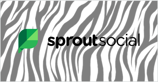 Use against busy or low contrast backgrounds
 Add additional elements
 Change the colors
 Fill with patterns
 Remove any of the 4 quadrants from the Sprout leaf