


Visual
Color
Sprout uses a dynamic and flexible color system to develop unexpected and relatable brand experiences with intention.
Foundational Palette
Sprout’s foundational colors serve as strong, grounding elements across backgrounds, text and borders, creating a dynamic base for our Brand Design System.
Designed with intentional simplicity, they ensure accessibility while setting the stage for fearless creative expressions that rouse and inspire.
Onyx
- Neutral 1100
- Hex: #040404
- RGB: 4, 4, 4
- CMYK: 0%, 0%, 0%, 98%
Snowcap
- Neutral 000
- Hex: #FFFFFF
- RGB: 255, 255, 255
- CMYK: 0%, 0%, 0%, 0%
Background gray
- Neutral 100
- Hex: #f3f4f4
- RGB: 243, 244, 244
- CMYK: 0%, 0%, 0%, 4%
Border gray
- Neutral 200
- Hex: #dee1e1
- RGB: 222, 225, 225
- CMYK: 1%, 0%, 0%, 12%
Overlay gray
- Neutral 950
- Hex: #1D2525
- RGB: 29, 37, 37
- CMYK: 22%, 0%, 0%, 85%
Medium gray
- Neutral 700
- Hex: #515e5f
- RGB: 81, 94, 95
- CMYK: 15%, 1%, 0%, 63%
Core Palette
Sprout’s Core Palette embodies the brand’s evolution while staying true to its foundation. The signature combination of green, teal and blue has become a distinct marker of Sprout’s identity—instantly recognizable and deeply ingrained in its brand presence. Green maintains strong brand equity, while blue reinforces Sprout’s fearless leadership and trusted authority. Teal, blending green and blue, strikes the perfect balance between innovation and trust.
Consistent use of this palette across brand touch points ensures a rousing, unmistakable presence that captivates and sets Sprout apart.
Emerald
- Green 900
- Hex: #006b40
- RGB: 0, 107, 64
- CMYK: 100%, 0%, 40%, 58%
Cactus
- Green 500
- Hex: #59cb59
- RGB: 89, 203, 89
- CMYK: 56%, 0%, 56%, 20%
Fern
- Green 300
- Hex: #98e58e
- RGB: 152, 229, 142
- CMYK: 34%, 0%, 38%, 10%
Mint
- Green 100
- Hex: #d7f4d7
- RGB: 215, 244, 215
- CMYK: 12%, 0%, 12%, 4%
Jade
- Teal 1000
- Hex: #083f3f
- RGB: 8, 63, 63
- CMYK: 87%, 0%, 0%, 75%
Spruce
- Teal 900
- Hex: #026661
- RGB: 2, 102, 97
- CMYK: 98%, 0%, 5%, 60%
Ocean
- Teal 500
- Hex: #08c4b2
- RGB: 8, 196, 178
- CMYK: 96%, 0%, 9%, 23%
Glacier
- Teal 300
- Hex: #7dead5
- RGB: 125, 234, 213
- CMYK: 47%, 0%, 9%, 8%
Mist
- Teal 050
- Hex: #CCF1EA
- RGB: 204, 241, 234
- CMYK: 15%, 0%, 3%, 5%
Midnight
- Blue 1000
- Hex: #0a2960
- RGB: 10, 41, 96
- CMYK: 90%, 57%, 0%, 62%
Sapphire
- Blue 900
- Hex: #0c3f89
- RGB: 12, 63, 137
- CMYK: 91%, 54%, 0%, 46%
Cobalt
- Blue 700
- Hex: #205bc3
- RGB: 32, 91, 195
- CMYK: 84%, 53%, 0%, 24%
Cornflower
- Blue 300
- Hex: #a1c2f8
- RGB: 161, 194, 248
- CMYK: 35%, 22%, 0%, 3%
Sky
- Blue 200
- Hex: #c7dbf9
- RGB: 199, 219, 249
- CMYK: 20%, 12%, 0%, 2%
Secondary Palette
Sprout’s Secondary Palette is made up of warm, nature-inspired shades that complement the distinction and authority of the Core Palette. When paired together, these colors create a bold contrast that demands attention, sparks fearless energy and introduces an unexpected edge to our brand expression.
This palette is designed to enhance visual impact, balance foundational elements and bring vibrancy and harmony to Sprout’s identity.
Citrine
- Yellow 700
- Hex: #dd9903
- RGB: 221, 153, 3
- CMYK: 0%, 31%, 99%, 13%
Marigold
- Yellow 600
- Hex: #ffbc00
- RGB: 255, 188, 0
- CMYK: 0%, 26%, 100%, 0%
Sunrise
- Yellow 300
- Hex: #ffe16e
- RGB: 255, 225, 110
- CMYK: 0%, 12%, 57%, 0%
Canary
- Yellow 100
- Hex: #fdefcd
- RGB: 253, 239, 205
- CMYK: 0%, 6%, 19%, 1%
Almandine
- Pink 900
- Hex: #931847
- RGB: 147, 24, 71
- CMYK: 0%, 84%, 52%, 42%
Rose
- Pink 700
- Hex: #ce3665
- RGB: 206, 54, 101
- CMYK: 0%, 74%, 51%, 19%
Salmon
- Orange 300
- Hex: #ffb180
- RGB: 255, 177, 128
- CMYK: 0%, 31%, 50%, 0%
Apricot
- Orange 100
- Hex: #fcdccc
- RGB: 252, 220, 204
- CMYK: 0%, 13%, 19%, 1%
Tourmaline
- Magenta 900
- Hex: #6c2277
- RGB: 108, 34, 119
- CMYK: 9%, 71%, 0%, 53%
Orchid
- Magenta 700
- Hex: #ac44a8
- RGB: 172, 68, 168
- CMYK: 0%, 60%, 2%, 33%
Violet
- Magenta 350
- Hex: #EC9AF1
- RGB: 236, 154, 241
- CMYK: 2%, 36%, 0%, 5%
Periwinkle
- Purple 200
- Hex: #d8d7f9
- RGB: 216, 215, 249
- CMYK: 13%, 14%, 0%, 2%
Accessibility
Adhering to WCAG 2.1 AA standards is not just a best practice but a crucial aspect of our design philosophy. Ensuring our designs meet these accessibility guidelines is essential for creating an inclusive digital environment. This commitment not only reflects our dedication to social responsibility and legal compliance but also enhances user experience and broadens our reach. It's our responsibility to follow these standards in order to guarantee that our content is accessible to a wider audience.
Accessibility Tips
- Check your color contrast using a contrast checker tool. Figma has a built in checker located with their color picker in the Fill sidebar widget.
- Ensure that color is not the only method used to convey important information.
- Use legible font sizes, no smaller than 16px, that also adhere to color accessibility standards based on size.
Color intention
Sprout’s brand color system offers a versatile toolkit for creators to craft rousing and memorable visual communications. These recommended colorways ensure brand consistency and cohesion across all marketing channels while prioritizing accessibility.
Color should always be applied with intention, considering the message, emotion or product alignment that different pairings convey. Thoughtful use of color can create unexpected impact, amplify meaning, and strengthen audience connections in bold and dynamic ways.
Social Intelligence and ROI of Social
The Core Palette of green, teal and blue should be used for communications focused on Social Intelligence and the ROI of Social. These colors represent Sprout as the leading Social Intelligence platform, reinforcing our credibility, signaling industry leadership and amplifying our forward-thinking presence to ensure a cohesive and impactful brand expression.
Emerald
- Green 900
- Hex: #006b40
- RGB: 0, 107, 64
- CMYK: 100%, 0%, 40%, 58%
Cactus
- Green 500
- Hex: #59cb59
- RGB: 89, 203, 89
- CMYK: 56%, 0%, 56%, 20%
Fern
- Green 300
- Hex: #98e58e
- RGB: 152, 229, 142
- CMYK: 34%, 0%, 38%, 10%
Mint
- Green 100
- Hex: #d7f4d7
- RGB: 215, 244, 215
- CMYK: 12%, 0%, 12%, 4%
Jade
- Teal 1000
- Hex: #083f3f
- RGB: 8, 63, 63
- CMYK: 87%, 0%, 0%, 75%
Spruce
- Teal 900
- Hex: #026661
- RGB: 2, 102, 97
- CMYK: 98%, 0%, 5%, 60%
Ocean
- Teal 500
- Hex: #08c4b2
- RGB: 8, 196, 178
- CMYK: 96%, 0%, 9%, 23%
Glacier
- Teal 300
- Hex: #7dead5
- RGB: 125, 234, 213
- CMYK: 47%, 0%, 9%, 8%
Mist
- Teal 050
- Hex: #CCF1EA
- RGB: 204, 241, 234
- CMYK: 15%, 0%, 3%, 5%
Midnight
- Blue 1000
- Hex: #0a2960
- RGB: 10, 41, 96
- CMYK: 90%, 57%, 0%, 62%
Sapphire
- Blue 900
- Hex: #0c3f89
- RGB: 12, 63, 137
- CMYK: 91%, 54%, 0%, 46%
Cobalt
- Blue 700
- Hex: #205bc3
- RGB: 32, 91, 195
- CMYK: 84%, 53%, 0%, 24%
Cornflower
- Blue 300
- Hex: #a1c2f8
- RGB: 161, 194, 248
- CMYK: 35%, 22%, 0%, 3%
Sky
- Blue 200
- Hex: #c7dbf9
- RGB: 199, 219, 249
- CMYK: 20%, 12%, 0%, 2%
AI and Automation
Use magentas and blues for communications centered on AI and automation functionality. This color pairing aligns with Sprout’s established color symbolism for AI-driven solutions and aligns with industry conventions, reinforcing Sprout’s authority and association with advanced technology and innovation.
Tourmaline
- Magenta 900
- Hex: #6c2277
- RGB: 108, 34, 119
- CMYK: 9%, 71%, 0%, 53%
Orchid
- Magenta 700
- Hex: #ac44a8
- RGB: 172, 68, 168
- CMYK: 0%, 60%, 2%, 33%
Violet
- Magenta 350
- Hex: #EC9AF1
- RGB: 236, 154, 241
- CMYK: 2%, 36%, 0%, 5%
Periwinkle
- Purple 200
- Hex: #d8d7f9
- RGB: 216, 215, 249
- CMYK: 13%, 14%, 0%, 2%
Midnight
- Blue 1000
- Hex: #0a2960
- RGB: 10, 41, 96
- CMYK: 90%, 57%, 0%, 62%
Sapphire
- Blue 900
- Hex: #0c3f89
- RGB: 12, 63, 137
- CMYK: 91%, 54%, 0%, 46%
Cobalt
- Blue 700
- Hex: #205bc3
- RGB: 32, 91, 195
- CMYK: 84%, 53%, 0%, 24%
Cornflower
- Blue 300
- Hex: #a1c2f8
- RGB: 161, 194, 248
- CMYK: 35%, 22%, 0%, 3%
Sky
- Blue 200
- Hex: #c7dbf9
- RGB: 199, 219, 249
- CMYK: 20%, 12%, 0%, 2%
Influencer Marketing
Yellow and teal are strategically used to represent Influencer Marketing with yellow symbolizing the IM product platform, a key tool in driving impactful collaborations. The infusion of teal adds a unique touch of Sprout's brand, giving visuals a distinct, ownable quality that differentiates our approach to influencer partnerships.
Citrine
- Yellow 700
- Hex: #dd9903
- RGB: 221, 153, 3
- CMYK: 0%, 31%, 99%, 13%
Marigold
- Yellow 600
- Hex: #ffbc00
- RGB: 255, 188, 0
- CMYK: 0%, 26%, 100%, 0%
Sunrise
- Yellow 300
- Hex: #ffe16e
- RGB: 255, 225, 110
- CMYK: 0%, 12%, 57%, 0%
Canary
- Yellow 100
- Hex: #fdefcd
- RGB: 253, 239, 205
- CMYK: 0%, 6%, 19%, 1%
Jade
- Teal 1000
- Hex: #083f3f
- RGB: 8, 63, 63
- CMYK: 87%, 0%, 0%, 75%
Spruce
- Teal 900
- Hex: #026661
- RGB: 2, 102, 97
- CMYK: 98%, 0%, 5%, 60%
Ocean
- Teal 500
- Hex: #08c4b2
- RGB: 8, 196, 178
- CMYK: 96%, 0%, 9%, 23%
Glacier
- Teal 300
- Hex: #7dead5
- RGB: 125, 234, 213
- CMYK: 47%, 0%, 9%, 8%
Mist
- Teal 050
- Hex: #CCF1EA
- RGB: 204, 241, 234
- CMYK: 15%, 0%, 3%, 5%
Customer Care
Green and teal are strategically used to represent Customer Care, with green symbolizing the Engagement product pillar, an essential workflow in providing effective customer support. The infusion of teal adds a unique touch of Sprout's brand, giving visuals a distinct, ownable quality that differentiates our approach to customer care.
Emerald
- Green 900
- Hex: #006b40
- RGB: 0, 107, 64
- CMYK: 100%, 0%, 40%, 58%
Cactus
- Green 500
- Hex: #59cb59
- RGB: 89, 203, 89
- CMYK: 56%, 0%, 56%, 20%
Fern
- Green 300
- Hex: #98e58e
- RGB: 152, 229, 142
- CMYK: 34%, 0%, 38%, 10%
Mint
- Green 100
- Hex: #d7f4d7
- RGB: 215, 244, 215
- CMYK: 12%, 0%, 12%, 4%
Jade
- Teal 1000
- Hex: #083f3f
- RGB: 8, 63, 63
- CMYK: 87%, 0%, 0%, 75%
Spruce
- Teal 900
- Hex: #026661
- RGB: 2, 102, 97
- CMYK: 98%, 0%, 5%, 60%
Ocean
- Teal 500
- Hex: #08c4b2
- RGB: 8, 196, 178
- CMYK: 96%, 0%, 9%, 23%
Glacier
- Teal 300
- Hex: #7dead5
- RGB: 125, 234, 213
- CMYK: 47%, 0%, 9%, 8%
Mist
- Teal 050
- Hex: #CCF1EA
- RGB: 204, 241, 234
- CMYK: 15%, 0%, 3%, 5%
Product focus
Color assignments have been given to product focuses to help create a distinct visual identity for each product workflow, making it easier for audiences to connect with specific features and values. This ensures clarity and visually guides the audience through the product marketing and education experience.
Product-driven color assignments should be applied throughout the entire customer journey, from awareness to decision, when highlighting specific focuses, features and values of the product. Maintaining these color applications in customer onboarding and success communications ensures a consistent, visually cohesive experience that extends beyond purchase.
Publishing
Tourmaline
- Magenta 900
- Hex: #6c2277
- RGB: 108, 34, 119
- CMYK: 9%, 71%, 0%, 53%
Orchid
- Magenta 700
- Hex: #ac44a8
- RGB: 172, 68, 168
- CMYK: 0%, 60%, 2%, 33%
Violet
- Magenta 350
- Hex: #EC9AF1
- RGB: 236, 154, 241
- CMYK: 2%, 36%, 0%, 5%
Periwinkle
- Purple 200
- Hex: #d8d7f9
- RGB: 216, 215, 249
- CMYK: 13%, 14%, 0%, 2%
Engagement
Emerald
- Green 900
- Hex: #006b40
- RGB: 0, 107, 64
- CMYK: 100%, 0%, 40%, 58%
Cactus
- Green 500
- Hex: #59cb59
- RGB: 89, 203, 89
- CMYK: 56%, 0%, 56%, 20%
Fern
- Green 300
- Hex: #98e58e
- RGB: 152, 229, 142
- CMYK: 34%, 0%, 38%, 10%
Mint
- Green 100
- Hex: #d7f4d7
- RGB: 215, 244, 215
- CMYK: 12%, 0%, 12%, 4%
Analytics
Almandine
- Pink 900
- Hex: #931847
- RGB: 147, 24, 71
- CMYK: 0%, 84%, 52%, 42%
Rose
- Pink 700
- Hex: #ce3665
- RGB: 206, 54, 101
- CMYK: 0%, 74%, 51%, 19%
Salmon
- Orange 300
- Hex: #ffb180
- RGB: 255, 177, 128
- CMYK: 0%, 31%, 50%, 0%
Apricot
- Orange 100
- Hex: #fcdccc
- RGB: 252, 220, 204
- CMYK: 0%, 13%, 19%, 1%
Listening
Midnight
- Blue 1000
- Hex: #0a2960
- RGB: 10, 41, 96
- CMYK: 90%, 57%, 0%, 62%
Cobalt
- Blue 700
- Hex: #205bc3
- RGB: 32, 91, 195
- CMYK: 84%, 53%, 0%, 24%
Cornflower
- Blue 300
- Hex: #a1c2f8
- RGB: 161, 194, 248
- CMYK: 35%, 22%, 0%, 3%
Sky
- Blue 200
- Hex: #c7dbf9
- RGB: 199, 219, 249
- CMYK: 20%, 12%, 0%, 2%
Advocacy
Jade
- Teal 1000
- Hex: #083f3f
- RGB: 8, 63, 63
- CMYK: 87%, 0%, 0%, 75%
Ocean
- Teal 500
- Hex: #08c4b2
- RGB: 8, 196, 178
- CMYK: 96%, 0%, 9%, 23%
Glacier
- Teal 300
- Hex: #7dead5
- RGB: 125, 234, 213
- CMYK: 47%, 0%, 9%, 8%
Mist
- Teal 050
- Hex: #CCF1EA
- RGB: 204, 241, 234
- CMYK: 15%, 0%, 3%, 5%
Influencer Mktg
Marigold
- Yellow 600
- Hex: #ffbc00
- RGB: 255, 188, 0
- CMYK: 0%, 26%, 100%, 0%
Citrine
- Yellow 700
- Hex: #dd9903
- RGB: 221, 153, 3
- CMYK: 0%, 31%, 99%, 13%
Sunrise
- Yellow 300
- Hex: #ffe16e
- RGB: 255, 225, 110
- CMYK: 0%, 12%, 57%, 0%
Canary
- Yellow 100
- Hex: #fdefcd
- RGB: 253, 239, 205
- CMYK: 0%, 6%, 19%, 1%
Gradient
Gradients are a powerful way to bring the brand to life. They help express a louder, prouder identity that radiates fearless, rousing energy. Gradients should be highly saturated and vibrant, creating bold visual impact. Whether used as a focal point or a background texture, they add depth, dimension and an element of surprise. Especially in digital and web design, gradients enhance the user experience by creating dynamic transitions that draw attention and guide the eye, helping creative stand out with confidence and clarity.
Gradient tips
- Intentional application: Use gradients to draw the user’s attention to specific areas, such as CTAs or important content/imagery. The goal is to guide the user journey, not distract from it.
- Subtlety is key: Opt for subtle gradient transitions. Overly dramatic shifts in color can be visually overwhelming and detract from a design or user experience.
- Prioritize Accessibility: When applying gradients as backgrounds, ensure text is readable by using high color contrast. If needed, add solid text boxes or overlays to improve clarity for all users.
- Consistency across mediums: Maintain a consistent gradient style throughout individual mediums. This consistency aids in creating a cohesive look that helps build trust with our audience.
- Test on different devices: Check how gradients appear on various devices and screen sizes. This ensures that the visual impact is consistent across all formats.
Spotlight gradients
Spotlight gradients convey a strong sense of energy, momentum and movement. Their flowing, circular paths create visual rhythm and dimensionality, making designs feel dynamic and alive. This motion-like quality draws the eye across layouts, guiding attention while adding depth and intrigue.
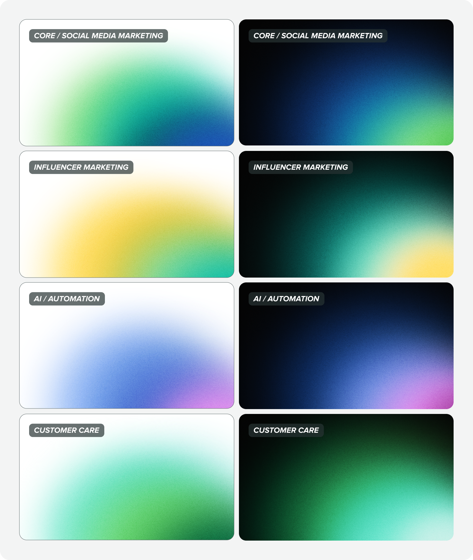
Usage: Spotlight gradients
Use spotlight gradients on backgrounds to subtly guide the viewer's eye toward the most important content, creating a natural focal point and enhancing visual hierarchy.

Linear gradients
Linear gradients bring bold, powerful energy to designs. Their consistent flow of color creates a sense of forward momentum and clarity, while their simplicity allows them to support rather than compete with other elements.
Usage: Linear gradients
Use linear gradients to add visual interest by applying them to backgrounds, textural elements or type for a dynamic and visually engaging effect.

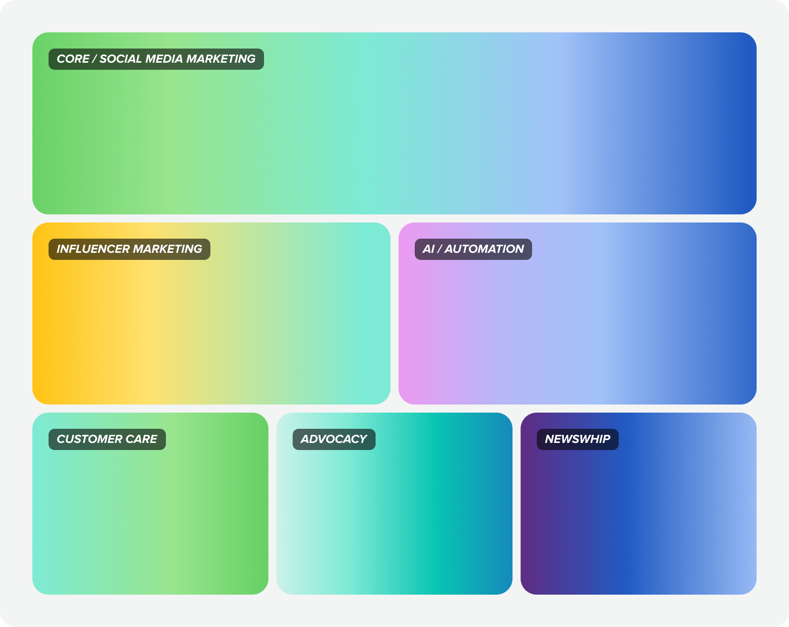
Product pillar gradients
Product focus gradients ignite the core strength of our product pillars, amplifying their impact with bold, vibrant energy. Rooted in our pillar color system, these gradients command attention in product imagery and feature-focused spaces, spotlighting the power of Sprout's tools.
Usage: Product pillar gradients
Use product pillar gradients to represent specific product workflows, clearly tying them to their corresponding pillar.

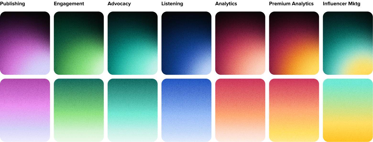
Noise
Noise, when paired with gradients, adds an extra layer of depth and texture to keep backgrounds from feeling flat or overly sterile. Noise is also a great device to help reduce color banding in gradients.
Use noise textures consistently across backgrounds, hero sections, and large gradient areas where added depth can help anchor key content. Always check legibility and contrast to ensure the noise effect doesn't compete with text or key visuals.
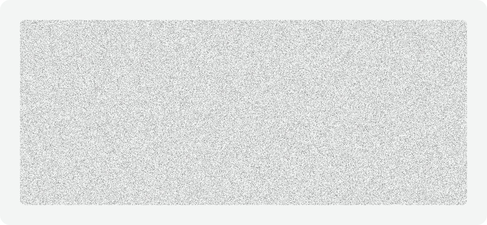
To use the noise texture shared above:
- Apply noise as an image over spotlight gradients or as a fill layer over linear gradients
- Set the following fill properties:
- Blend mode to Overlay
- Scale to Tile with a percentage size that best fits your design
- Adjust fill opacity to keep visual interest subtle, balanced and unexpected, not distracting
Product color palette
Actions
Type
Common UI
Color finder
Enter a hex color value to find the closest Seeds color token match.