Visual
Illustration
Sprout utilizes both small and large illustrations for visual storytelling purposes across our brand.
Why do we use illustration?
Illustration is used to tell a story, convey a mood or utilize metaphor to make a complex idea clear and relevant. Illustrations are one of several ways to represent our brand and our values to our myriad audiences to engage and connect with them. Think of illustration in the same vein as photography and videography—visual storytelling tools. This distinguishes illustration from icons and other graphics which might resemble illustration but serve the purpose of helping a user navigate an interface.

How we want our illustrations to feel
Illustrations, like photography or other highly visual media, are ambassadors to what we call our Brand Personality. Specifically our brand persona of the Luminary has a few key characteristics that our brand should communicate: we are bold, we are inspiring and we are authentic.
Bold
Our illustrations use bright, inviting colors, often paired with dark line work, to create dynamic imagery involving people and objects in relevant situations.
Inspiring
Our illustrations most often depict the idealized state in any given situation. Not how something is now, but how we would want it to be. Straight-forward, understandable and dare we say it—fun.
Authentic
Central to our illustrations are people and recognizable objects. We want the user to see themselves in our imagery to create those moments of connection. Illustration is also an area to show our commitment to our Diversity, Equity and Inclusion efforts by representing a wide range of people of varying identities with a focus on prioritizing typically under-represented groups.
Types of illustrations
Currently, our defined illustration style that is core to our brand is a pixel-based “freehand” illustration style.
Across our brand, we also utilize a more geometric, vector-based graphic illustration style which is not currently covered in this documentation.
Spot illustrations
Spot illustrations are smaller and more contained. These still use simple metaphors but are more about showing emphatically what the paired content is telling you. No background scene here, these stand on their own.


Scenic spot
Scenic spot illustrations are more complex than a spot illustration but more digestible than a scene illustration. Like scene illustrations, they can include background elements. Instead of showing one or more objects in a unified lockup (like a spot illustration), scenic-spots show a single, unified vignette.


Scene
Scene illustrations are larger and more complex—without being complicated. They can also employ a deeper power of metaphor. They take complicated and technical ideas and explain them in a way you’d want to understand, creating their own little story. They include a more detailed foreground and background.


Guidelines
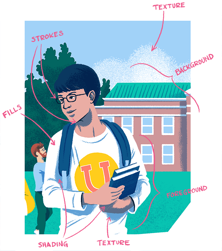
Illustration Anatomy

Fills: Solid areas of a particular color.
Strokes: Drawn lines used for emphasis or visual clarity.
Shading: Areas of color used to create visual depth and define shape and form.
Texture: Areas of the illustration that have the consistency of a tactile surface. This is used to create more subtlety within the illustration as well as to add detail and elegance.
Foreground: Objects and people closer to the front of a scene. Things in the foreground tend to be more detailed and of more importance to the story.
Background: Objects or people in the back of the scene. The background is used to create a sense of place, a mood, and additional context useful to the story.
Color Usage
To create the bright, bold colors used in our illustrations we utilize a combination of our Brand color palette along with the Humanistic color palette.
Feeling Blue?
Our blues are the backbone of illustration style. We create the shading in our illustration by multiplying an opacity of Blue 700 over the fills. We use Blue 1100 for our line work. Subtle objects meant to fall into the white of the page are set to Blue 300 or, if necessary, Blue 100.
Composition for spot illustrations
Spot illustrations generally exist on one plane. There aren’t a lot of compositional layers to account for.
Color
We start with our blues, white and humanistic colors (if applicable) to create the general structure of an illustration. Then, strategically add other brand colors to create accents (draw attention) or to help the objects be recognizable.
Line work
Line work is used to draw attention and to define shapes. For spot illustrations, line work is often used to help visually define the shape of objects that are depicted as white. But, we don’t outline the entire object; instead we selectively use line work to define certain areas of a shape so the user completes the rest of the shape in their mind. This creates a more engaging illustration.


Composition for scene illustrations
Because scene illustrations are more layered and complex, ideas of focal points and foreground versus background are introduced (among other visual concepts we won’t touch on here).
Color
Color is one of the ways we attract attention to the focal points of an illustration. Use brighter colors and more contrast in the foreground—particular in areas or on people who are meant to be central to the story of a particular illustration. The shading used in the foreground will also be darker and will help create more contrast.
The background, while still bold and vibrant, should not distract from the foreground and focal points. Choose less vibrant colors or perhaps use colors closer in value to each other to create a lower contrast scene. Keeping in step with this, shading used to render background objects will be less dark and create less contrast than foreground shading.
Typical shading amounts
Foreground shading (blue-700, multiplied, 70% opacity)
Background shading (blue-700, multiplied, 50% opacity)


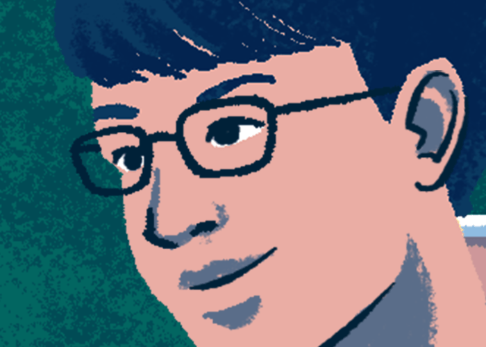
Line work

Because scene illustrations are more complex and have a greater sense of naturalism, line work is used less prominently than in spot illustrations. It is used mostly in the foreground and mostly to create areas of sharp contrast or defined shape to help define an important character/object or draw the eye. Examples of this would be using dark line work to create facial features like eyes and the line of the mouth.