Visual
Frame Library
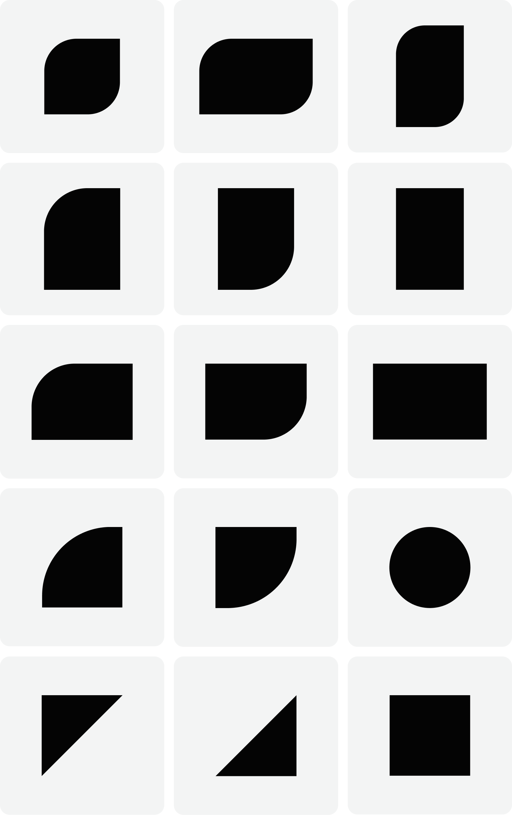
Layout and composition are the building blocks of design. A strong composition attracts attention, clarifies understanding and engages the viewer with intention and mastery. Our unique frame library consists of fifteen shapes distilled from the Sprout leaf icon, sans stem.
Frame usage
Use the frame library to house photography, illustrations and content. When scaling frames, always maintain proportional curves on the upper left and lower right curved corners. Horizontal and vertical frames may be extended for flexibility in layouts, but only one aspect ratio should be adjusted at a time.

Frame origin
Distilled from the square leaf frame, quadrants produce three unique shapes.
Distilled from the horizontal leaf frame, quadrants produce three unique shapes.
Distilled from the vertical leaf frame, quadrants produce three unique shapes.
A circle represents the leaf in its most simplified form.
Distilled from the full color leaf, the upper right quadrant produces two unique shapes.
Creating new frames
Be cautious and thoughtful when considering introducing new shapes to the frame library. Continue to build with intention and validate against the mathematical structure of the original library. Consider the need and origin: Why is the new shape necessary? How does the new shape strengthen the library? Where is the new shape derived from?
Frames in layout
Frames add personality and variety to layouts. Frames may be used in their entirety or expanded to bleed off the page. Use multiple uniform frames to tell a series of stories within a single design or arrange a variety of frames thoughtfully within a single layout.


In motion
Shift perspective and illuminate opportunity by applying motion to the frames. Forward progress and upward growth is at the core of our brand identity and expressed in the curves of our mark. This movement can be expressed through motion.

Apply motion to the leaf frame that represents upward and to the right progress.
 Expand and contract the frame horizontally or vertically from the center to illuminate imagery.