Visual
Data visualization
We use data visualization to represent complex numerical data and patterns in a clear and concise format. We use infographics to present simple data in a more compelling format.
Data visualization
A data visualization prioritizes conveying large amounts of numerical information in a simple, visually digestible format. These visual representations of data should be aesthetically appealing, but not at the expense of being clear, consistent and thoughtful. Data visualizations are generally used in projects like annual report, data reports, and other data-heavy communication. At Sprout, we primarily use data visualizations in the Sprout Social Index and Brands Get Real.
General style and layout guidelines
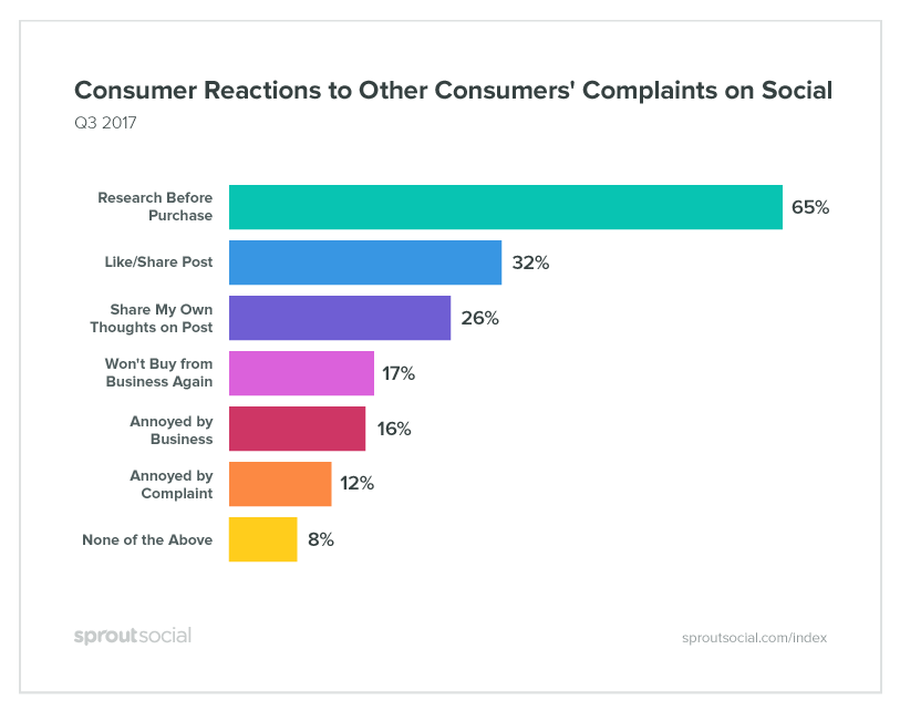
- Charts should sit on a white background with a gray border. The Sprout Social or Advocacy logo should be located in the bottom-left and a URL in the bottom-right.
- Layout specifics will vary by visualization type. Documented guidelines for data include:
- Bar charts
- Line charts
- Pie charts
- Tables
Color usage
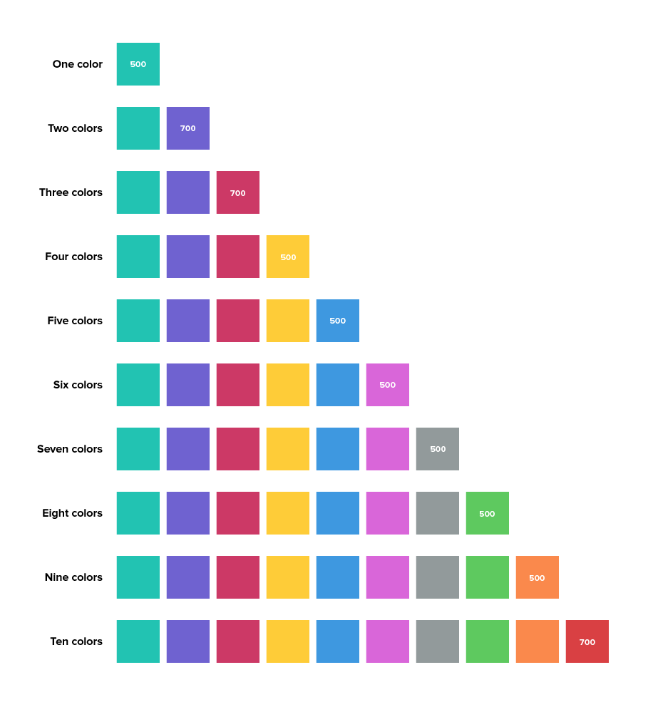
It’s about contrast! Color should be distinct to allow the viewer to quickly and easily distinguish data points.
Color combinations for general Sprout Social data visualizations
If you’re creating data visualizations for a brand campaign or initiative that has a specific color palette, you don’t need to use this color system. However, you should make sure that the colors you use have sufficient color contrast on the color wheel (avoid analogous color schemes).

Which data visualization should I use?
Bar charts

Bar charts are used for comparing discrete categories. Use a bar chart when there is a constraint to the number of data points that can appear on the visualization; otherwise, it becomes difficult to scale.
Best used for:
Discrete categories of data, like Retail vs Technology.
Line charts
A line chart is created by connecting a series of data points together with a line. Line charts are good to show change over time, comparisons, and trends.
Best used for:
Showing continuous data like sales or orders over time (Q1–Q4 2018).
Data labels and/or numerical values in line charts should be right aligned to the y-axis and center aligned on the x-axis. Data labels within the chart should be centered and placed above the corresponding data point.
Pie charts

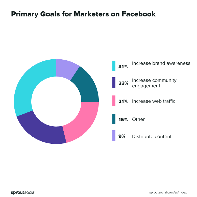
Pie charts are best to use when you are trying to compare parts of a whole (ie x% out of 100%). They do not show changes over time. They work best when the data points are simple and comparisons between different percentages are dramatic.
Best used for:
Comparing parts of a whole.
Because pie charts do not lend well to heavy text usage in the chart itself, keys are a good way to display topic labels.
Tables
A table is a good way to showcase a large amount of information which has a variety of columns and data to show for each entity. A table should be used when multiple metrics and categories need to be presented together, and accurate lookup of the data values is more important that showing patterns in the data.
Best used for:
-
Showing large amounts of discrete data with many variables
-
Showing values across multiple categories and measures
-
DO: Use lines and spacing to separate rows/cells of data.
-
DON'T: Use zebra striping (aka, alternating row colors).
Infographics
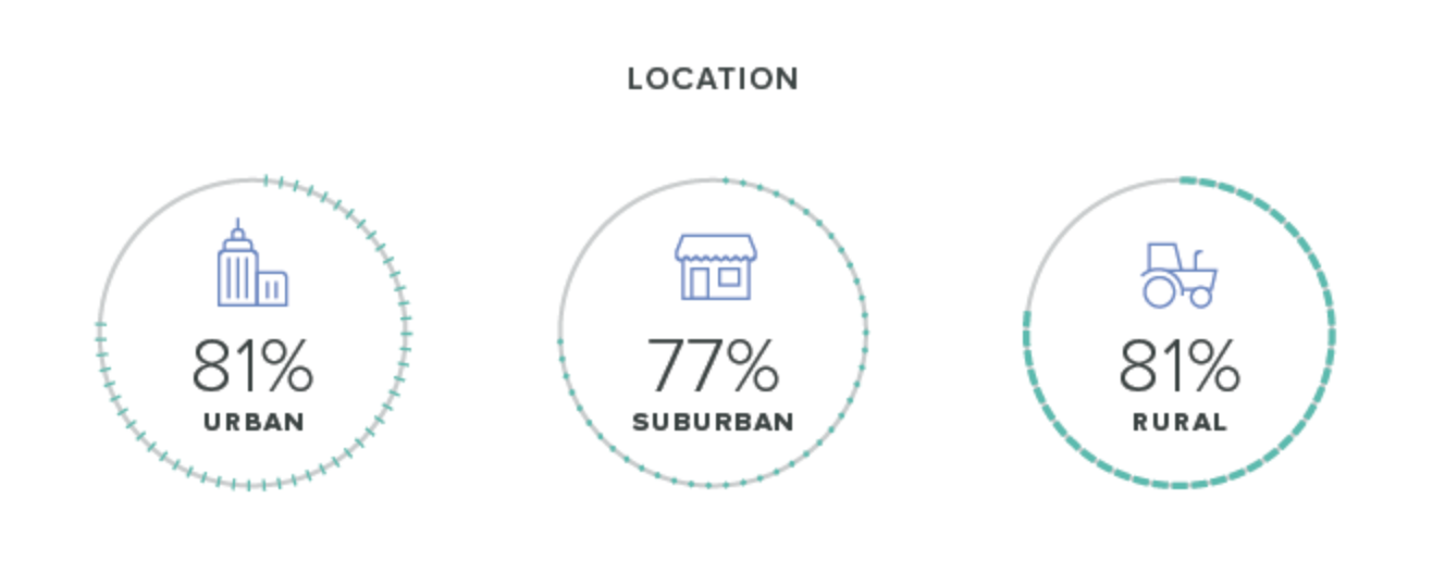
An infographic should be used to present simple data in an eye-catching, interesting way. Infographics are opportunities to use numerical information to support an accompanying story or to provide an opinion. As such, the guidelines around infographic design are much looser than more traditional data visualizations and a lot of what is presented about tweaked significantly.
General style and layout guidelines
Infographics can take many forms as their only goal is to support a single data point while adding visual interest. Some infographics may also use iconography or imagery to continue the contextual narrative.
Examples
