Visual
Brand typography
Typography guidelines ensure that we maximize legibility and maintain visual hierarchy throughout all of our content.
Typeface
Proxima Nova is a versatile, modern typeface that strikes a balance between geometric structure and bold, unapologetic character, making it a strong foundation for the Pacesetter persona. Its clarity and adaptability lend themselves well to expressive design without sacrificing readability or cohesion.
With a wide range of weights and styles, Proxima Nova allows for thoughtful, unexpected font pairings that bring both contrast and energy to layouts. This flexibility supports dynamic compositions that feel fearless and contemporary, while also leaving room for moments of surprise or refinement. When used intentionally, it gives the brand a distinct voice that can shift seamlessly across tone, format and medium.


Hierarchy & Scale
One of the most important techniques for effectively communicating content is the use of typographic hierarchy. Using variations in size, weight, color and position of type, typographic hierarchy ensures that important information stands out, while less important details fade into the background. This not only makes the content more legible and easy to understand, but also helps create a consistent and recognizable brand identity.
Type scale and weights
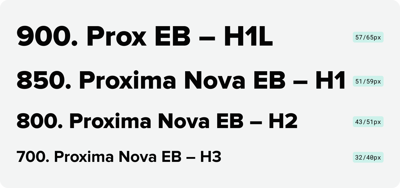
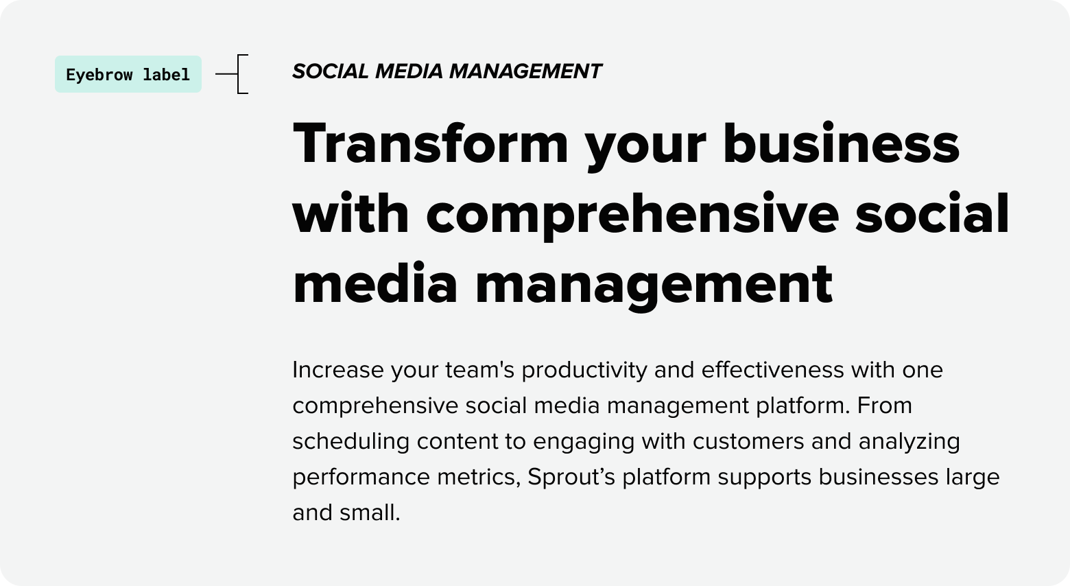
Headlines
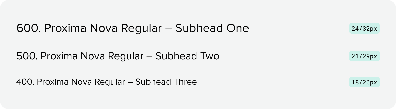
Subheads
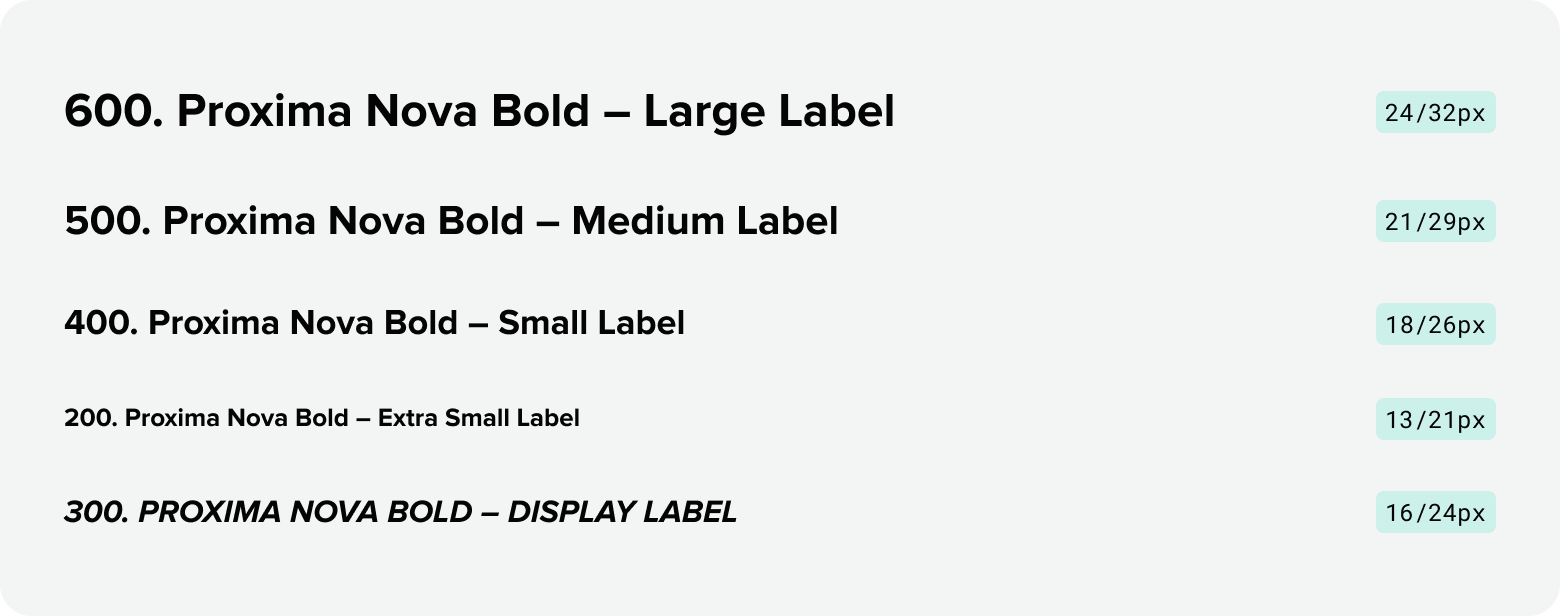
Labels
Paragraph + Links
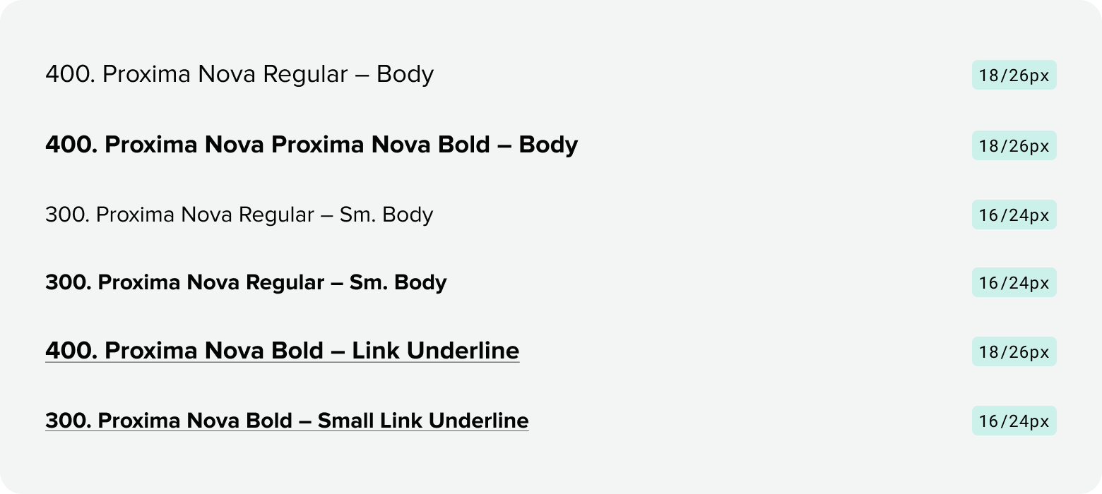
Misc

Display
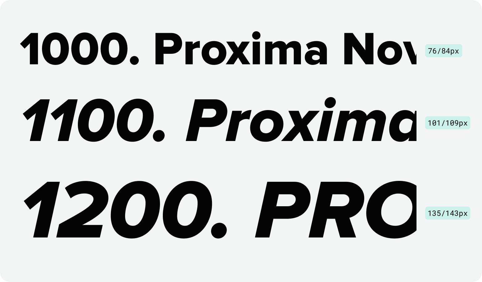
Additional display sizes
Should you require additional sizes for large-scale designs that require high-impact, attention-grabbing moments, there are six additional type sizes to choose from. These type styles should be used sparingly and strategically to maximize visual hierarchy and emotional resonance. All additional display sizes should be paired with generous whitespace and minimal supporting elements to maintain clarity and boldness.
| Type Level | Font Size | Line Height |
|---|---|---|
| Display XL | 150px | 158px |
| Display XXL | 165px | 173px |
| Display 3XL | 180px | 188px |
| Display Ultra XL | 200px | 208px |
| Display Ultra XXL | 220px | 228px |
| Display Ultra 3XL | 250px | 258px |
Type setting
When type setting content, it’s imperative to proofread and spellcheck everything. Additionally, follow the below dos and don’ts to ensure all content is set consistently.
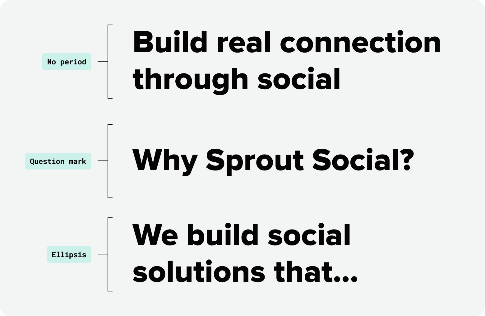
Sentence case for headlines
To feel more human and personal, all headlines should be written in sentence case. Seeds defines a headline as “the line of copy at the top of a piece of communication, used to draw the reader in.” Never use a period at the end of a title or headline. The only end punctuation used should be a question mark following a question, or an ellipsis if breaking up a sentence.
Title case for titles
At Sprout, we consider a title to be the name of a project, usually displayed on the cover, front page, first screen, etc. Title should be displayed in title case.

Title case for labels
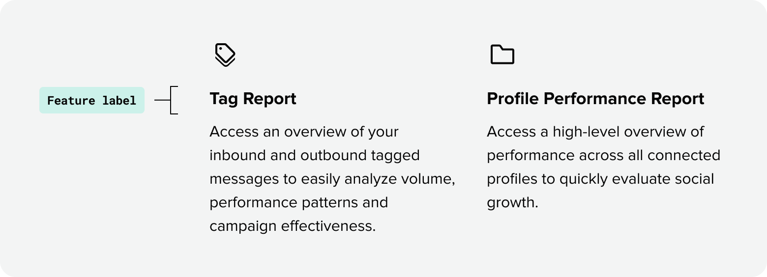
Often set in smaller sizes than surrounding content, labels set in bold title case provide a quick scannable overview for readers. Title case treatments also help maintain visual consistency for specific types of components on the web (i.e. feature grids).
All caps italics for eyebrow labels
Often set in smaller sizes than surrounding content, labels set in bold title case provide a quick scannable overview for readers. Title case treatments also help maintain visual consistency for specific types of components on the web (i.e. feature grids).
Sentence case for buttons and links
Since links can be present within body copy, the universal standard for all links are to be set in sentence case for consistency. Buttons are often paired with a link and should follow the same type setting. Sentence case buttons are an international standard and Sprout maintaining this consistency creates a familiar experience for our global audience.

Numbers and stats
When multiple data points or numbers are included in a single layout and treated as secondary or supporting content, typeset them in Proxima Nova for stronger scannability.
Larger, stand-alone stats can be typeset in Roboto Serif for additional visual emphasis.
Numbers and labels used in data visualizations should always be typeset in Proxima.

Type-setting rules at a glance
Email & Product
Email type
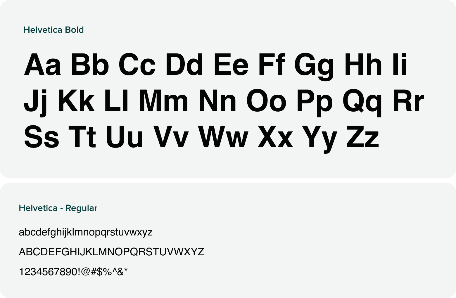
To ensure email content appears the same to all subscribers across all email providers, Helvetica Bold and Regular should be used as a fall back font in place of Proxima Nova. Sprout’s existing brand typography guidelines should be maintained for maximum legibility and to maintain visual hierarchy.
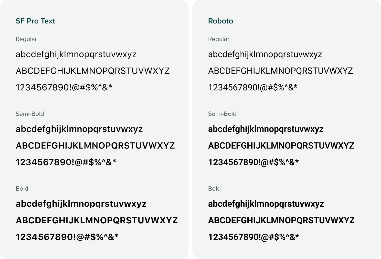
Product type
Our products utilize the system font families: San Francisco and Roboto.