


Patterns
Navigation
Navigation is the primary method of accessing different sections of our app. Refer to this pattern when creating, adjusting, or implementing navigation.
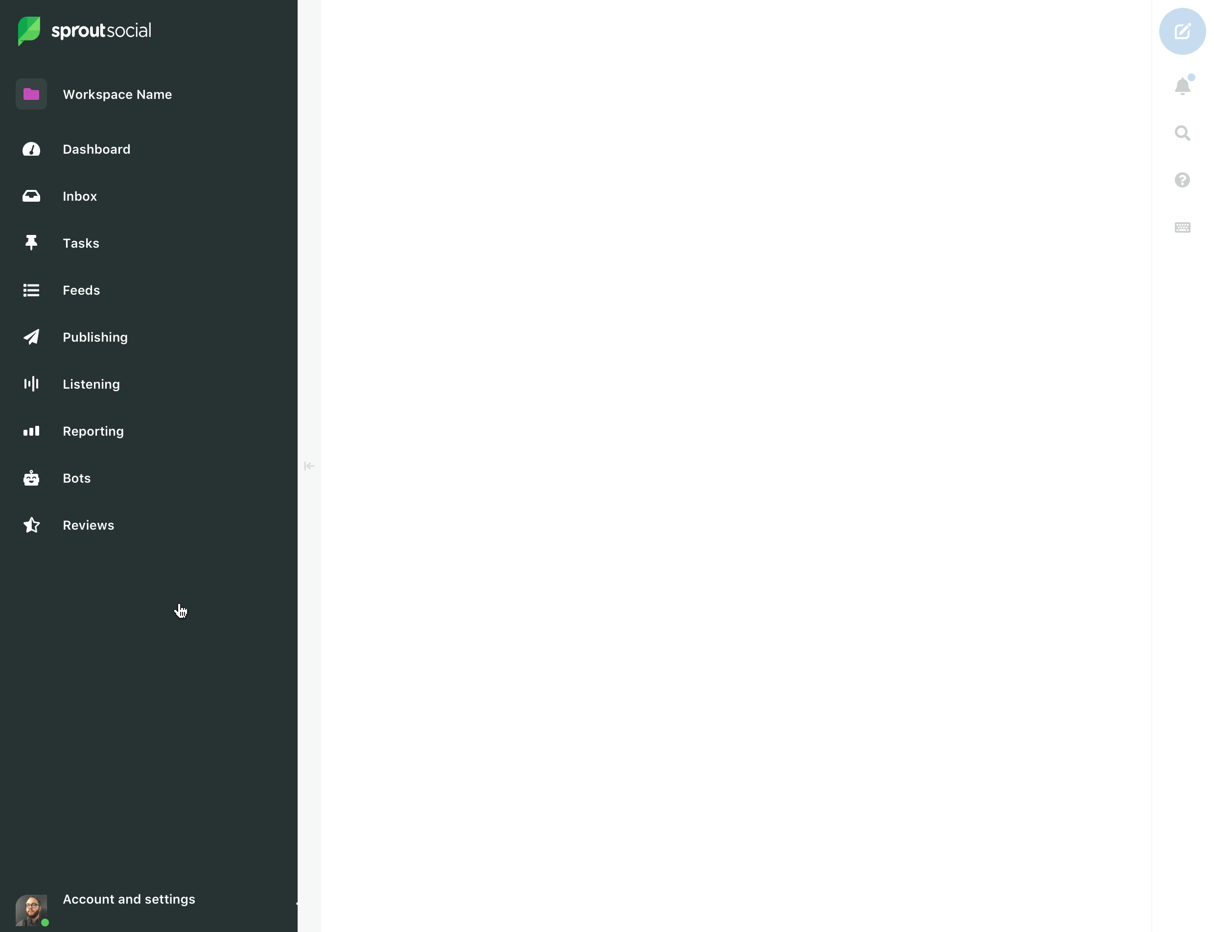
Main nav
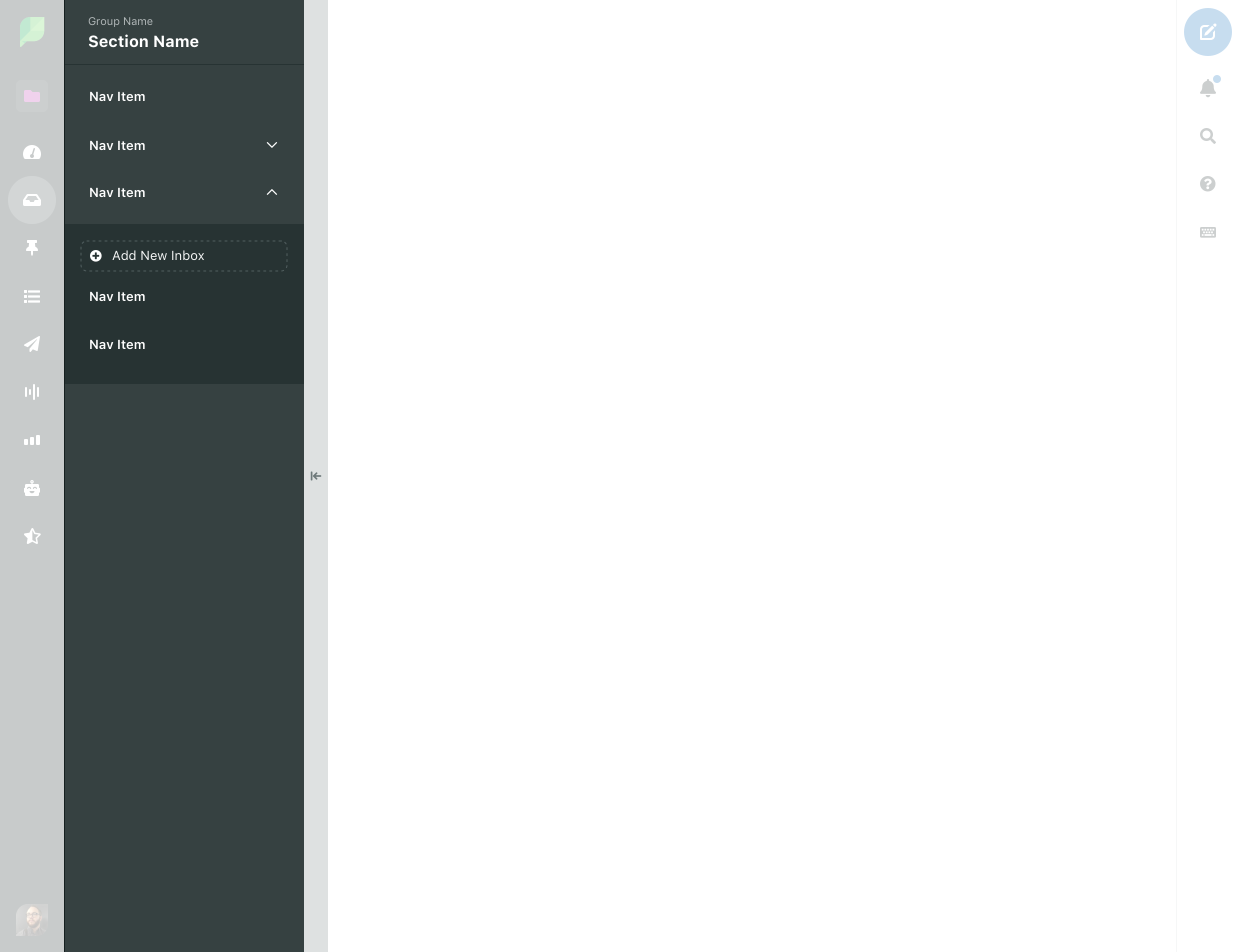
States
| Hover | |
| Selected |
Show on hover
On hover the Main Nav expands to it's full size exposing labels to the user.
Responsive
More information on main nav behavior at different screen sizes is available in our Layout package.
Scrolling
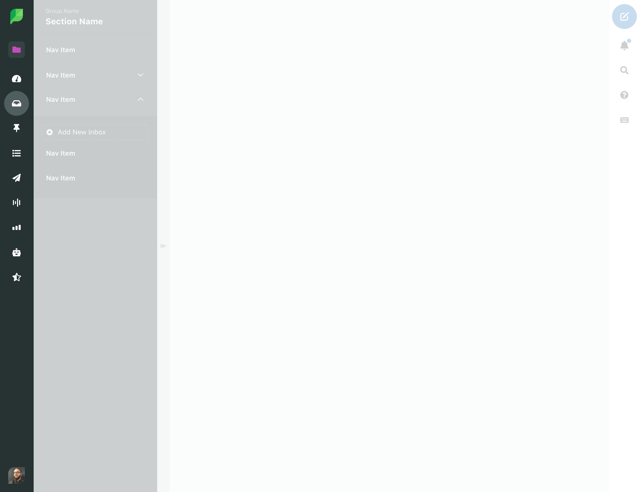
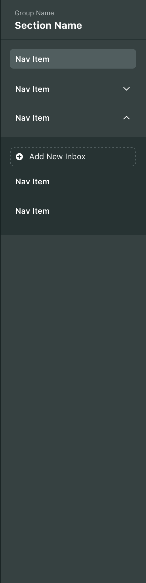
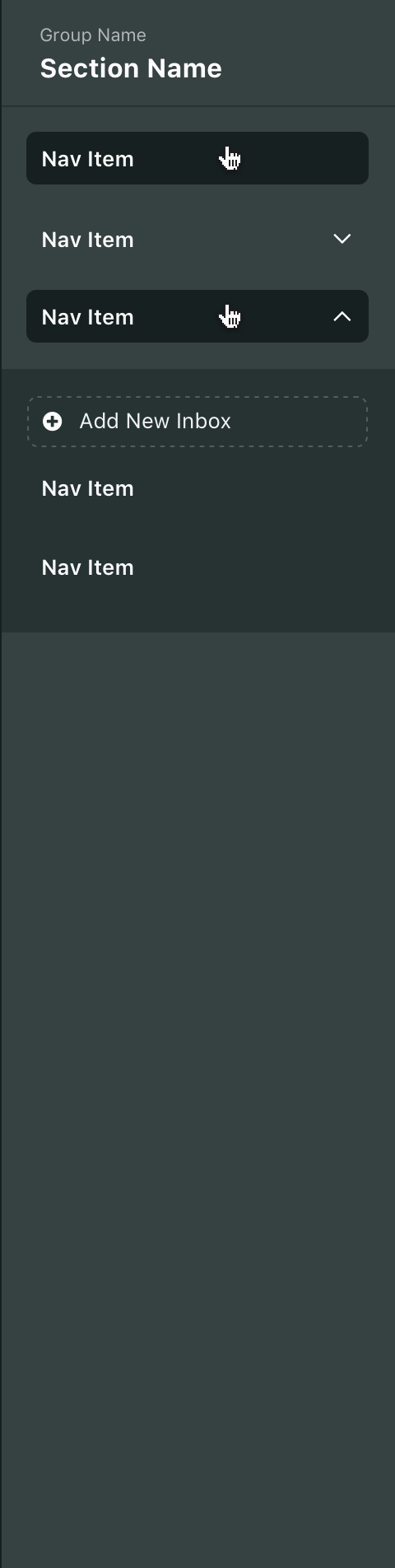
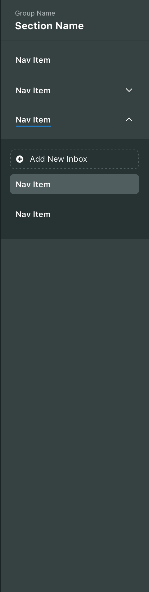
Secondary nav
States
| Hover | |
| Selected |
Accordions
From left to right: Standard accordion, hovered accordion, accordion with selected states
States
| Hover | |
| Selected | |
| Parent with selected child |
Behavior
- On click, accordions toggle open and closed
- A chevron icon is used to indicate the open/closed state of the accordion
- Chevron pointing up is open
- Chevron pointing down is closed
- Multiple accordions can be opened and closed
- Accordions work independently of other accordions
$Motion-ease--inout,$Motion-duration--medium
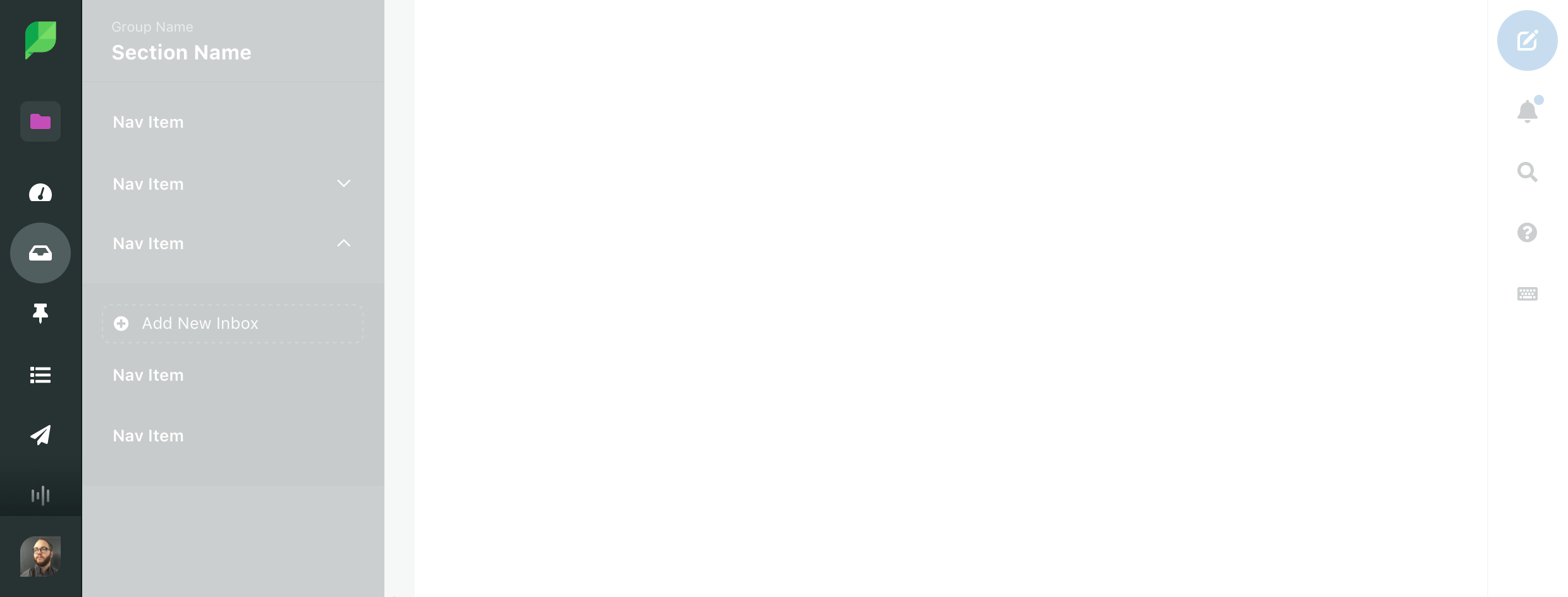
Scrolling
do
Allow the entire navigation to scroll as one unit
don't
Do not create multiple, fixed scrollable areas on screen
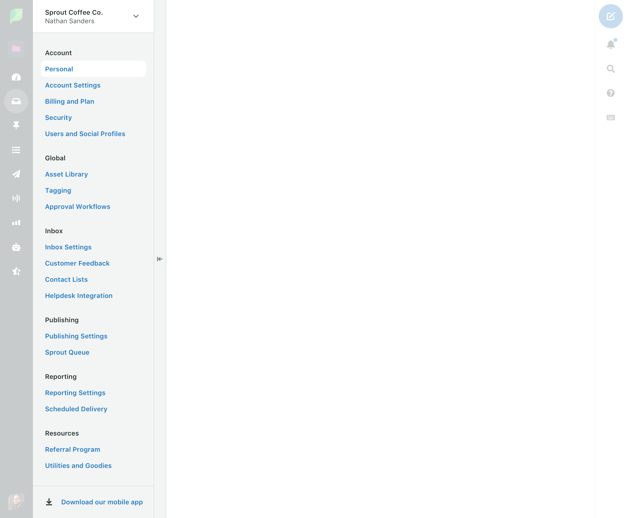
Settings nav
The Settings Nav behaves just like the secondary nav. However, the Settings Nav looks intentionally different as an indicator to users that they are in settings.
The Settings Nav defaults to open every visit. For users who spend a significant amount of time in settings, the nav can be closed until the next page load.
States
| Static category header | |
| Default link | |
| Hover background | |
| Selected background |