


Patterns
Layout
Our app’s layout provides users with consistent structure and behavior, as well as access to frequently used tools.
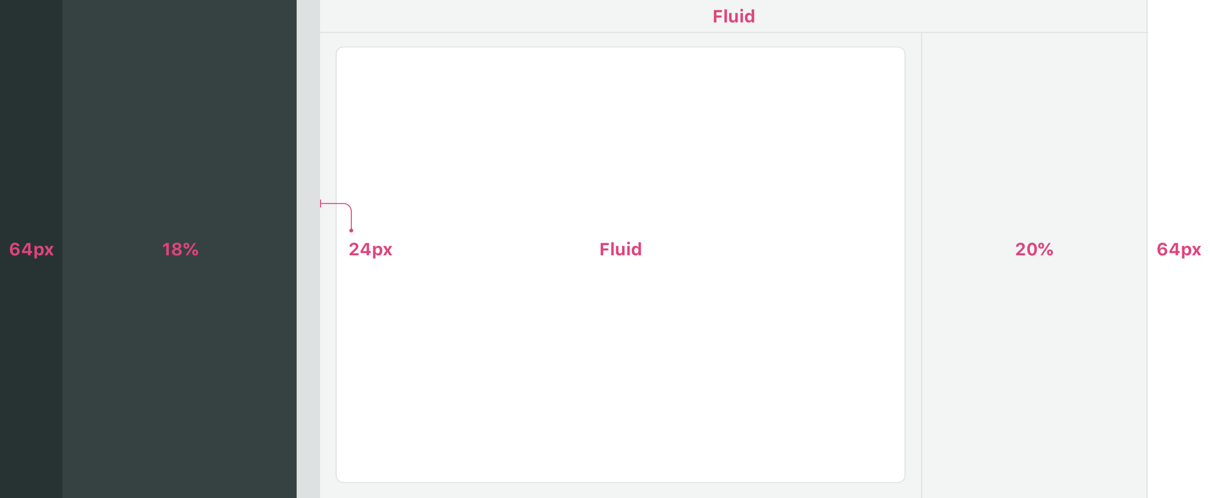
Our app's layout is comprised of four main parts.
The layout tailors the experience to the user depending on the size of their browser and the available options in a workflow.
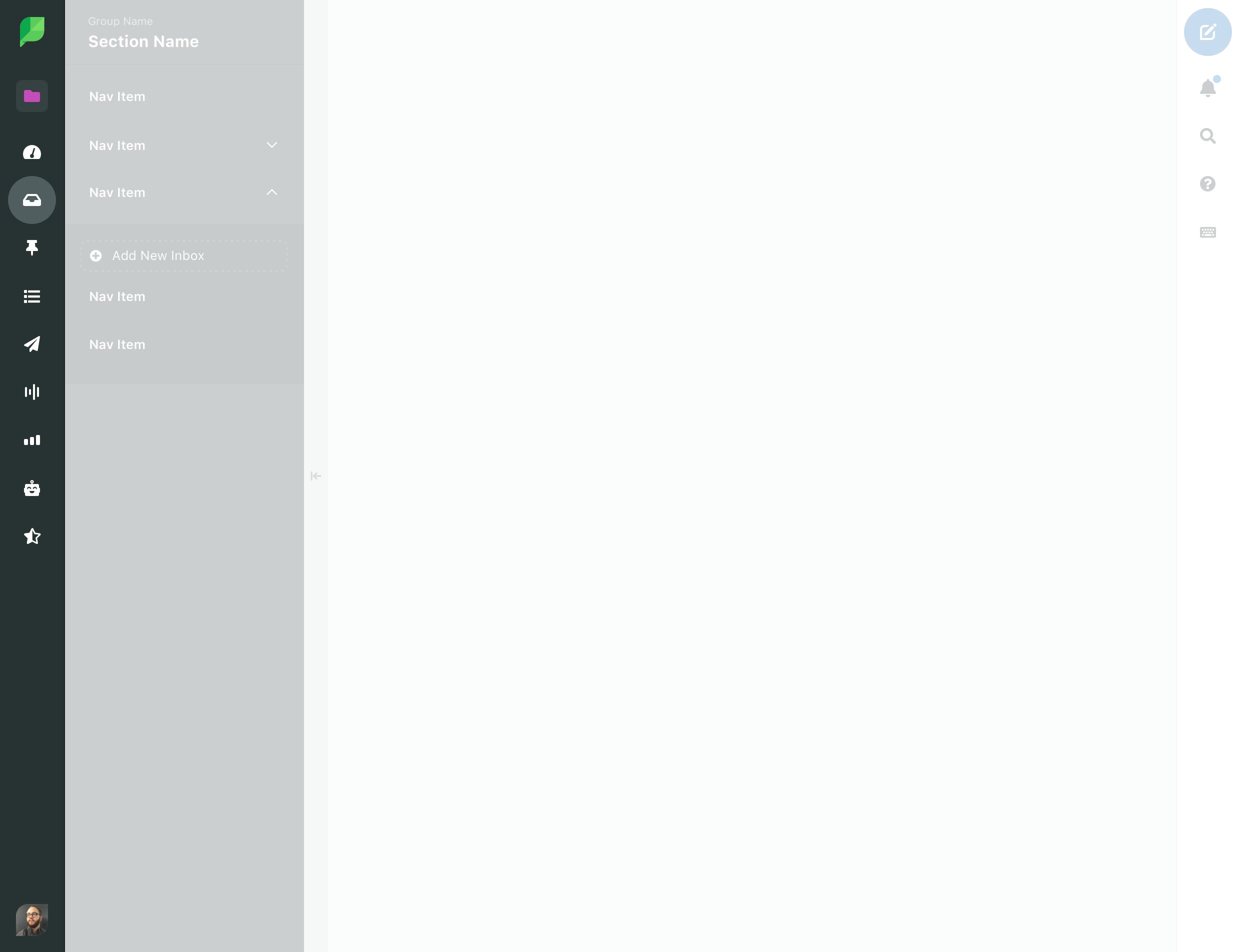
Main nav
The main nav is used to navigate to different sections of the app.
Width
The main nav is 64px wide.
Breakpoint
Expanded main nav: minimum width of 1800px
Secondary nav
The secondary nav is used to navigate between pages in a specific section of the app.
Width
18% of layout, minimum of 250px
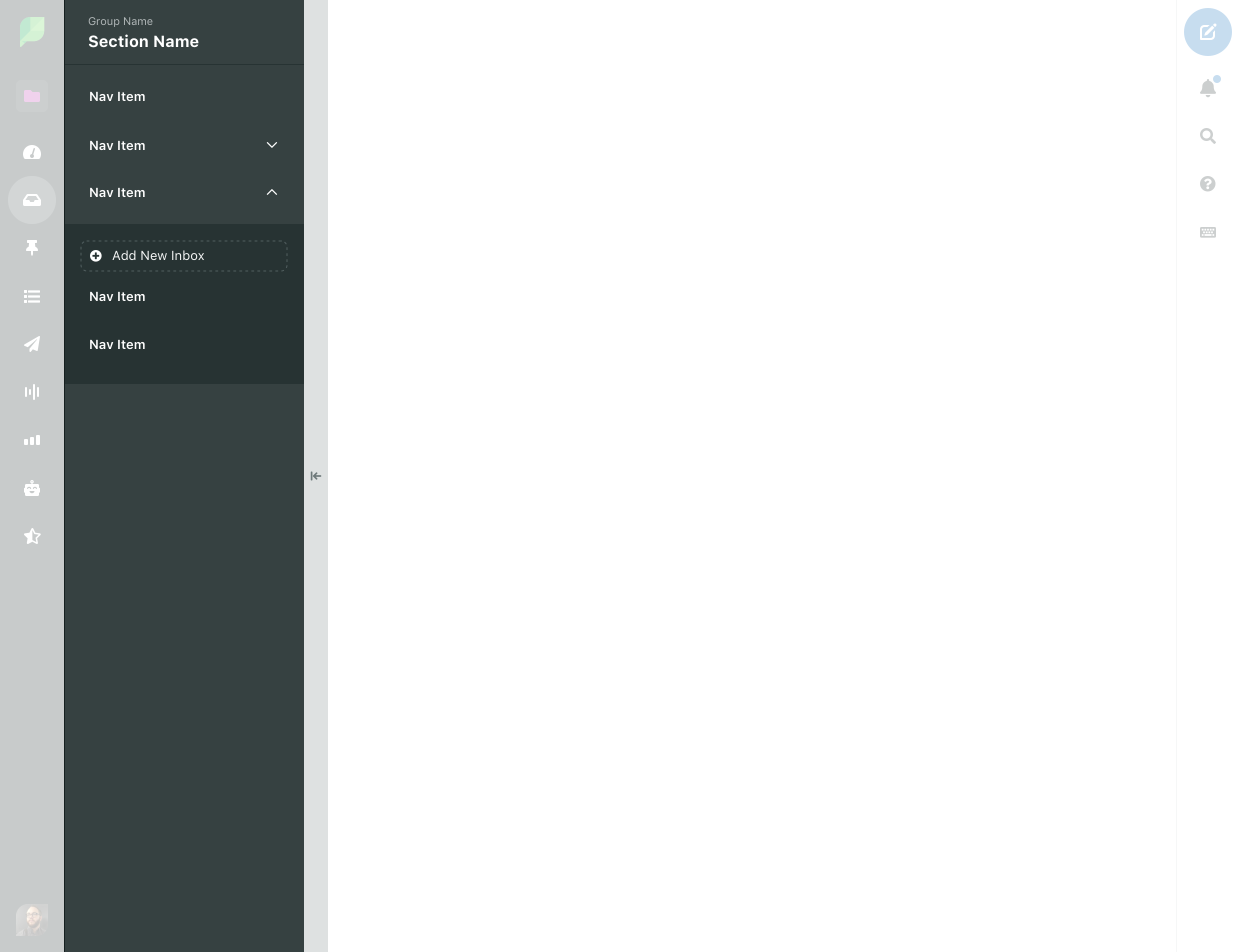
Trough
The Trough is the primary means of toggling the secondary nav open and closed. The Trough occupies 100% height and 24px width.
Content
Page header
The page header is always present at the top of any page. The page header can contain both the Page Title and the Page Actions. The page header is fluid but always has a minimum of 16px of padding.
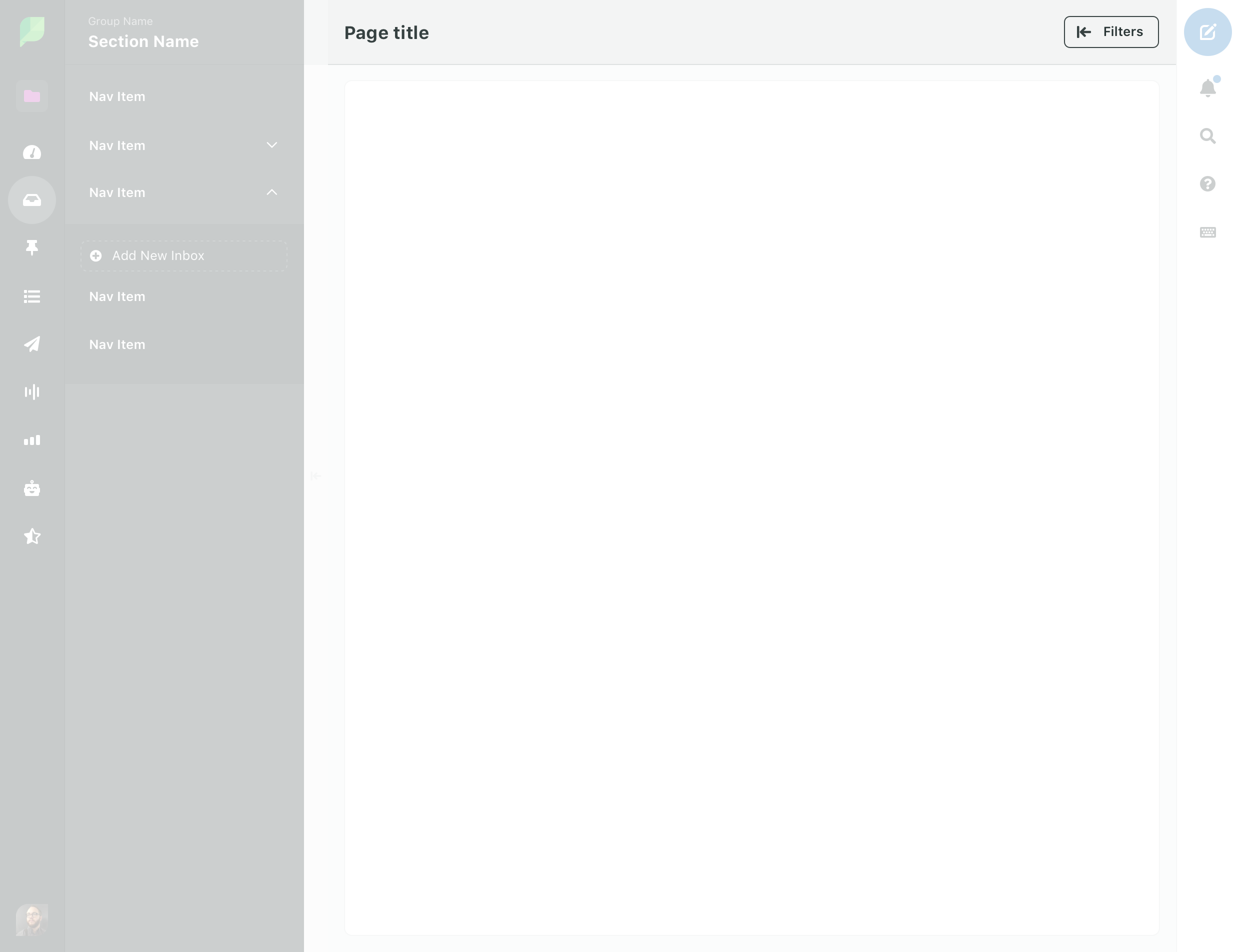
A Page Header with title and actions
Page title
A Page Title is the name of the current page. Every page has a Page Title.
Page header actions

Publishing Calendar
- Most page header level actions should use the Secondary button style
- Primary actions are used to save a view or as an action that will navigate the user away from the current page.
- Date range for scope of displayed data
- Is always the left most action if available
Date Pickeror Day/Week/Month cycle (calendar) define the data set being viewed.
- Overflow menu
[…]is for lower/lowest priority actions - Share/Export is the first action following Filters.
- Filters (or whatever toggles
Content Rail) is always the right most action. This is kept in close proximity toContent Railas it's primary purpose is togglingContent Railopen and closed.
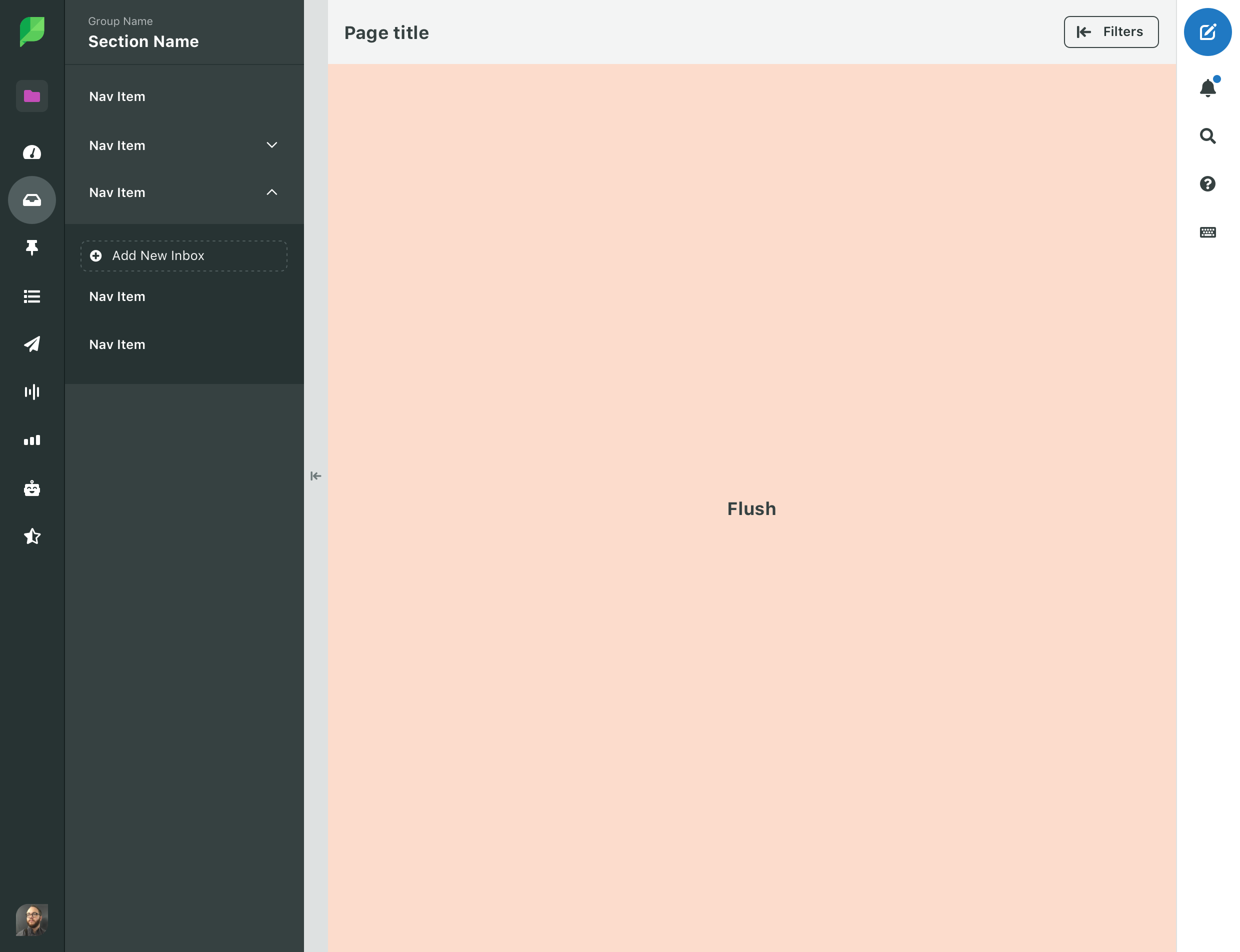
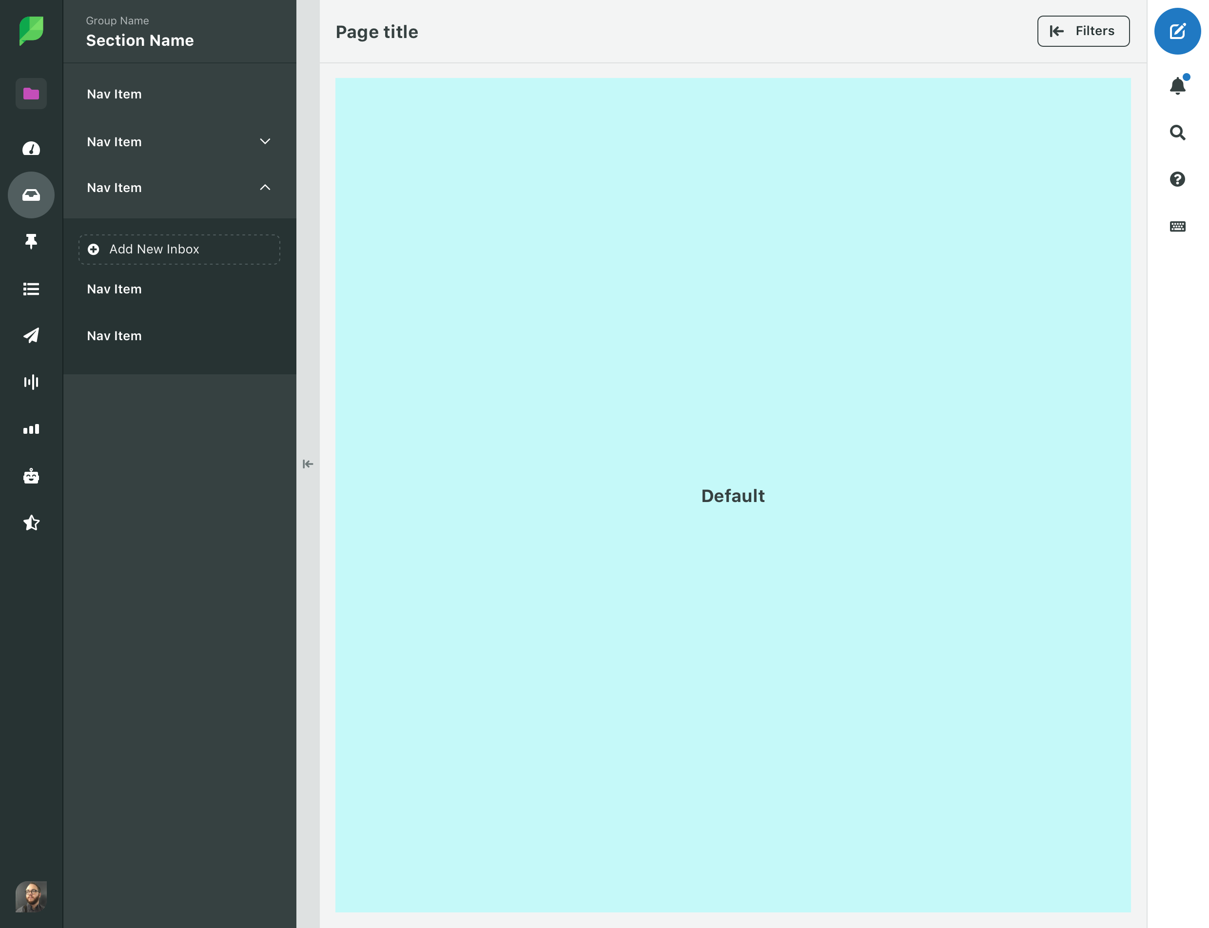
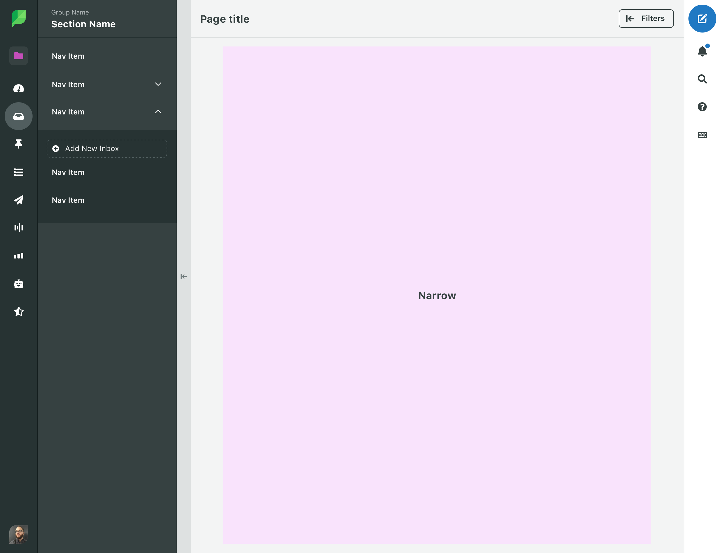
Page content
There are three types of layouts for page content.
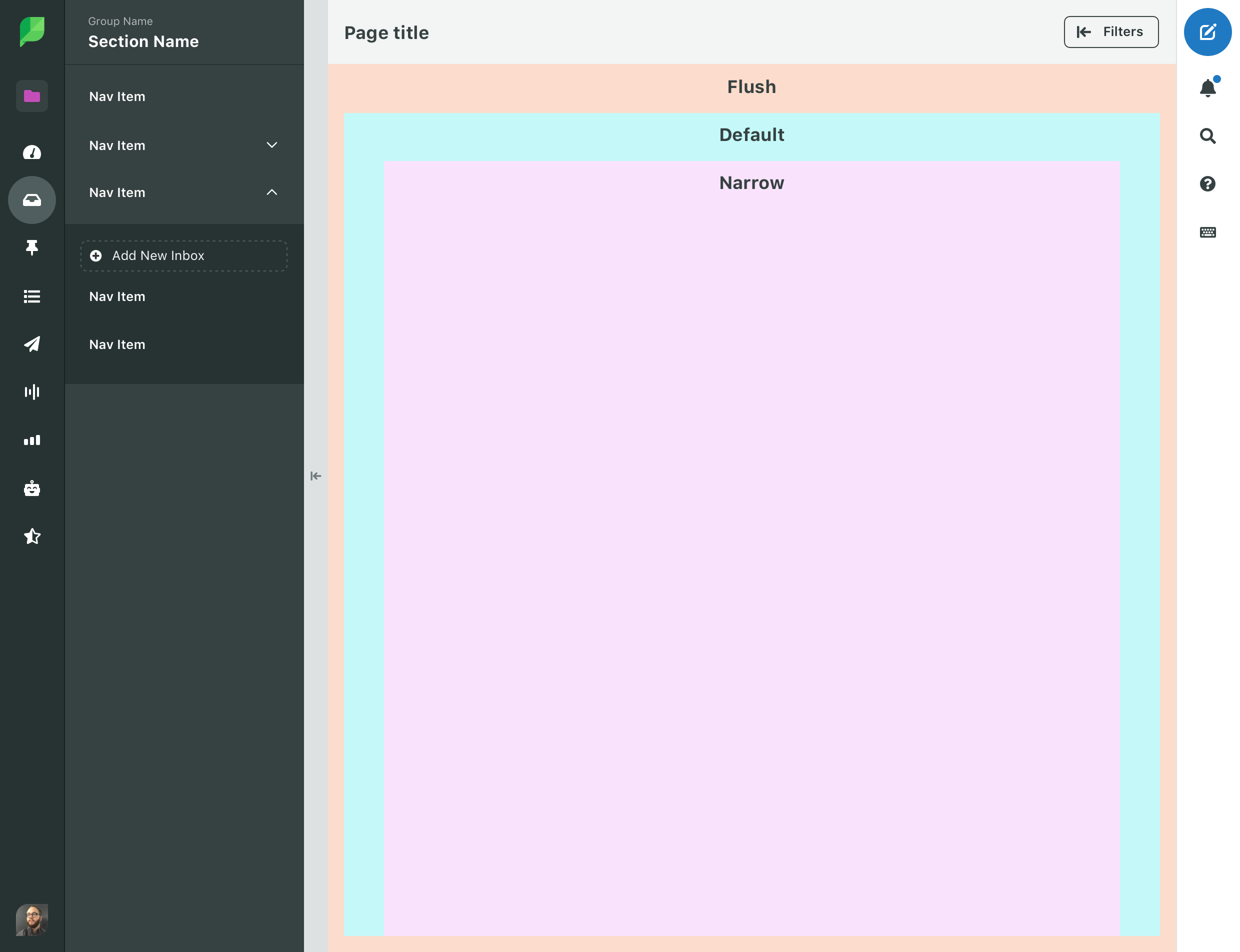
Flush
Flush content takes advantage of all available space with no maximum width and no padding. Examples include Asset Library, Calendar, and Dashboard.
Default
Default content has a max width of 1400px, padding of 16px and is centered in the content area. Examples include reports.
Narrow
Narrow content has a max width of 736px, my padding of 16px and is centered in the content area. Examples include Message Feeds.
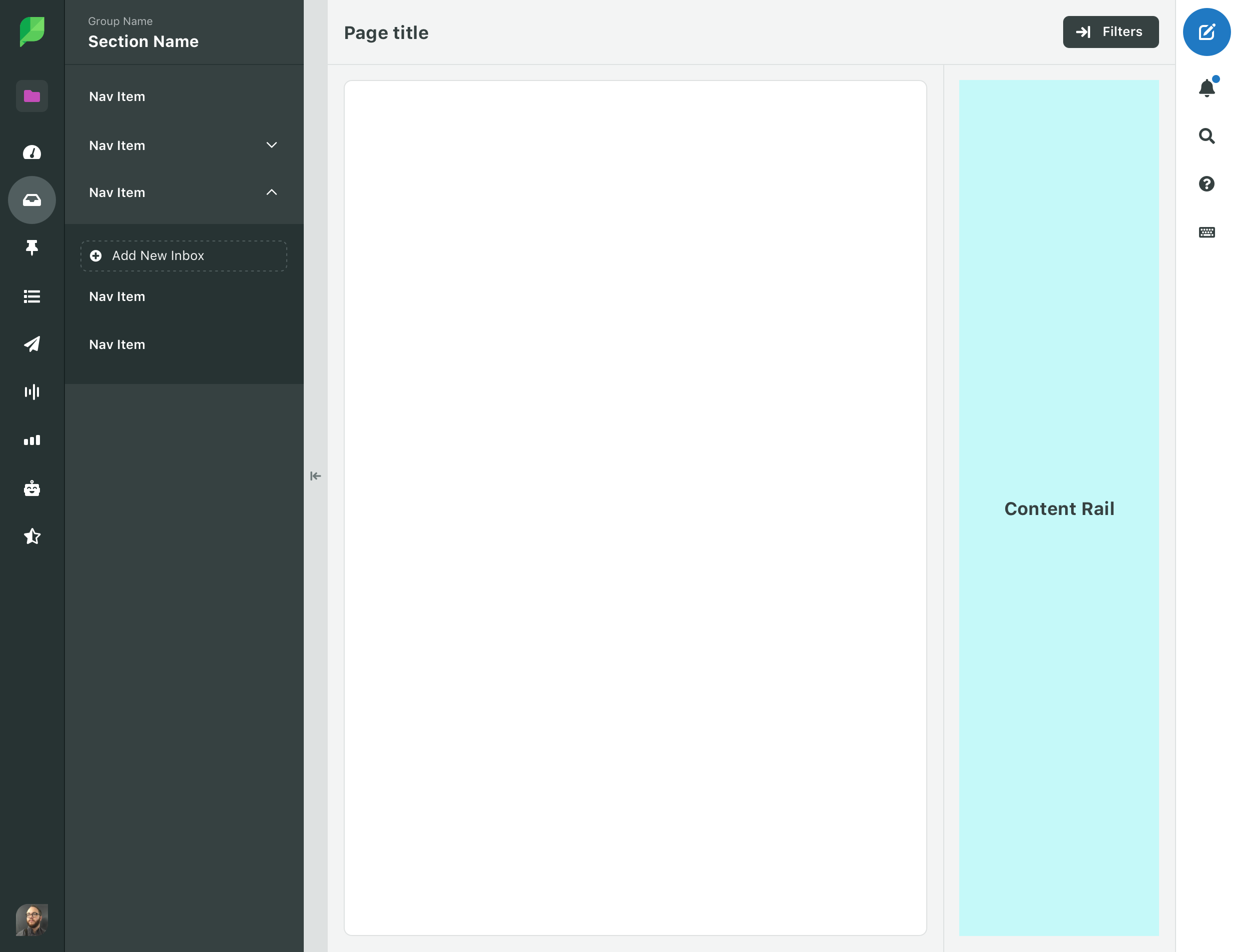
Content rail
The right most page level action toggles a rail that shows/hides additional content level actions like filters. Content rail occupies 20% of Page Content with a minimum of 224px and a maximum of 300px.
Content Rail is triggered from the right most page level action.
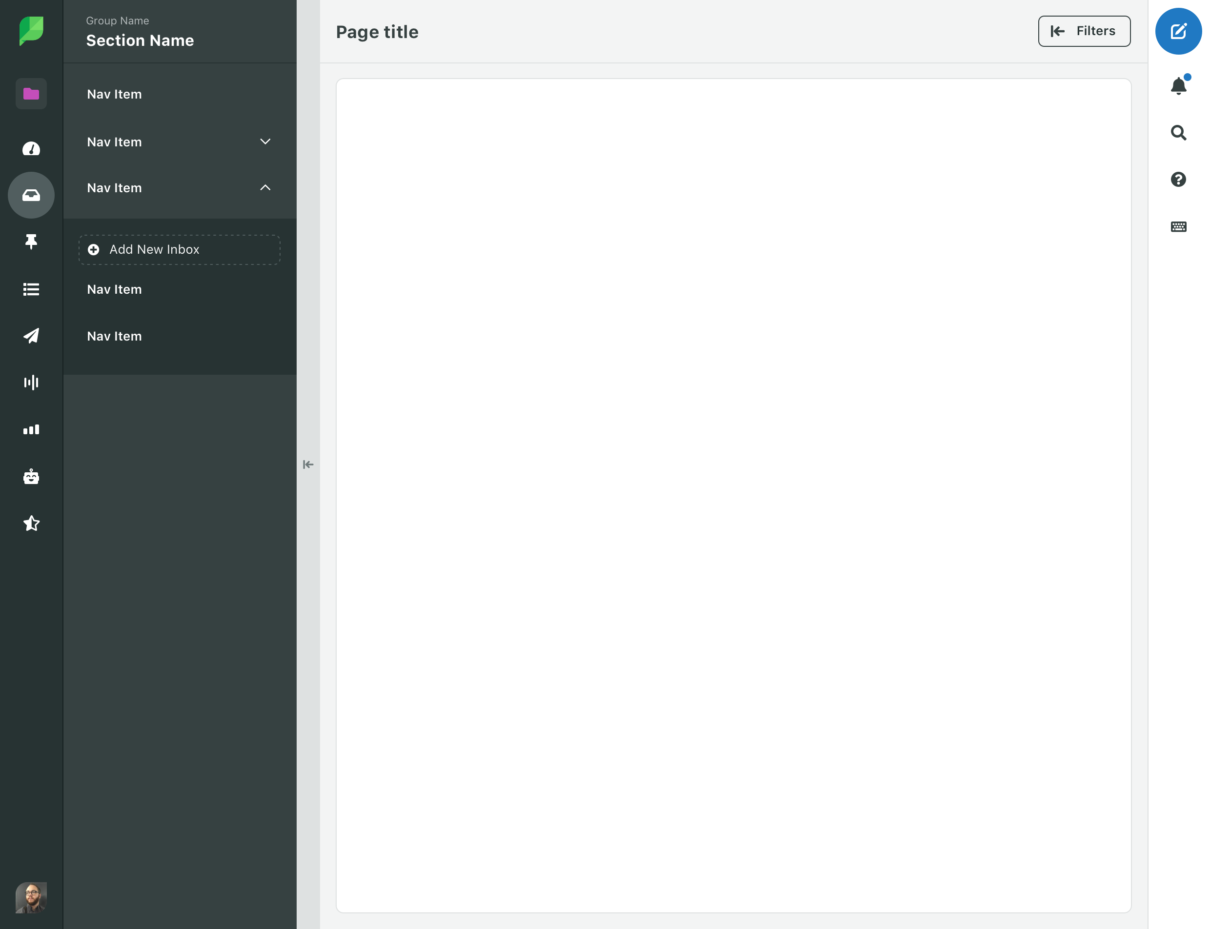
Toolbar
The toolbar contains a set of global tools that can be used anywhere in the app.
Width
The toolbar is 64px wide.