


Components
Modal
Modals are used to overlay content above an interface. They are intended to capture the user's attention in order to inform or shift focus to a pertinent task.
Modals can be used in various ways such as to confirm important or potentially destructive actions (e.g., deleting a message or upgrading a plan), to provide additional information, and to block user interaction in order to force action on critical tasks (e.g., billing errors, disconnected accounts, service outages, etc...)
Modal vs Legacy Modal
Key Differences
| Feature | Modal V2 | Legacy Modal (V1) |
|---|---|---|
| State Management | open / defaultOpen with onOpenChange | isOpen with onClose |
| Accessibility | Built on Radix UI Dialog with automatic ARIA attributes | Requires manual appElementSelector for focus management |
| Header API | title/subtitle props or ModalHeader component | Modal.Header subcomponent |
| Content API | ModalBody component | Modal.Content subcomponent |
| Footer API | ModalFooter with button props | Modal.Footer with children |
| Close Button | Automatic in floating rail | Modal.CloseButton subcomponent |
| TypeScript | Strong type safety with discriminated unions | Basic types |
| Mobile | Responsive bottom sheet layout | Desktop-focused |
| Draggable | Built-in support | Not available |
Migration Guide
Basic Modal
Legacy (V1):
const [open, setOpen] = useState(false)
<Modal  isOpen={open}  onClose={() => setOpen(false)}  label="Example Modal"  appElementSelector="#root">  <Modal.Header title="Title" subtitle="Subtitle" />  <Modal.Content>Content</Modal.Content>  <Modal.Footer>Footer</Modal.Footer></Modal>
Modal V2:
const [open, setOpen] = useState(false)
<ModalV2  open={open}  onOpenChange={setOpen}  title="Title"  subtitle="Subtitle"  aria-label="Example Modal">  <ModalBody>Content</ModalBody>  <ModalFooter primaryButton={<Button>Action</Button>} /></ModalV2>
Controlled State
Legacy (V1):
- Uses
isOpenprop (boolean) - Uses
onClosecallback (no parameters)
Modal V2:
- Uses
openprop (boolean) - Uses
onOpenChangecallback (receives new boolean state)
Header
Legacy (V1):
<Modal.Header title="Title" subtitle="Subtitle"/>// or custom<Modal.Header bordered> <CustomContent /></Modal.Header>Modal V2:
// Simple header (recommended)<ModalV2 title="Title" subtitle="Subtitle" />
// Or explicit component<ModalHeader title="Title" subtitle="Subtitle" />
// Custom header<ModalCustomHeader>  <CustomContent /></ModalCustomHeader>
Content
Legacy (V1):
<Modal.Content> Content here</Modal.Content>Modal V2:
<ModalBody> Content here</ModalBody>Footer
Legacy (V1):
<Modal.Footer> <Box display="flex" justifyContent="flex-end"> <Button onClick={handleClose}>Cancel</Button> <Button onClick={handleSave}>Save</Button> </Box></Modal.Footer>Modal V2:
// Buttons automatically close modal<ModalFooter  cancelButton={<Button>Cancel</Button>}  primaryButton={<Button>Save</Button>}/>
// Or custom footer<ModalCustomFooter>  <CustomContent /></ModalCustomFooter>
Close Button
Legacy (V1):
<Modal.CloseButton />Modal V2:
- Close button is automatically rendered in the floating action rail
- No need to manually add it
- Use
closeButtonAriaLabelprop to customize the label
Trigger Button
Legacy (V1):
<Button onClick={() => setOpen(true)}>Open</Button>Modal V2:
// Option 1: Manual trigger (same as V1)<Button onClick={() => setOpen(true)}>Open</Button>
// Option 2: Built-in trigger (new)<ModalV2  modalTrigger={<Button>Open</Button>}  defaultOpen={false}>  Content</ModalV2>
Accessibility
Legacy (V1):
- Requires
appElementSelectorprop for focus management - Requires
labelprop for accessibility - Manual focus trapping setup
Modal V2:
- Automatic focus management (no
appElementSelectorneeded) aria-labelrequired only when notitle/subtitleprovided- Built-in focus trapping via Radix UI
Accessible Triggers for Modal V1
Modal V1 triggers are typically a bare <Button onClick={() => setOpen(true)}> with no ARIA attributes. Screen readers can't tell the button opens a dialog or whether that dialog is currently open. Use useModalTriggerProps to fix this — one import, one spread.
Before:
const [isOpen, setIsOpen] = useState(false);
<Button onClick={() => setIsOpen(true)}>  Edit Profile</Button>
After:
import { useModalTriggerProps } from '@sproutsocial/racine';
const [isOpen, setIsOpen] = useState(false);const triggerProps = useModalTriggerProps(isOpen);
<Button {...triggerProps} onClick={() => setIsOpen(true)}>  Edit Profile</Button>
This adds the following attributes to your trigger automatically:
| Attribute | Value | Purpose |
|---|---|---|
aria-haspopup | "dialog" | Tells screen readers this button opens a dialog |
aria-expanded | true / false | Communicates whether the dialog is currently open |
aria-controls | modal ID | Links the trigger to the dialog element (when modalId is provided) |
No changes to the Modal itself are needed — focus restoration is already handled by Modal V1 via react-modal.
Common Migration Patterns
Pattern 1: Simple Confirmation Modal
Legacy (V1):
<Modal isOpen={open} onClose={() => setOpen(false)} label="Confirm"> <Modal.Header title="Delete?" /> <Modal.Content> <Text>Are you sure?</Text> </Modal.Content> <Modal.Footer> <Button onClick={() => setOpen(false)}>Cancel</Button> <Button onClick={handleDelete}>Delete</Button> </Modal.Footer></Modal>Modal V2:
<ModalV2 open={open} onOpenChange={setOpen} title="Delete?"> <ModalBody> <Text>Are you sure?</Text> </ModalBody> <ModalFooter cancelButton={<Button>Cancel</Button>} primaryButton={<Button appearance="destructive">Delete</Button>} /></ModalV2>Pattern 2: Form Modal
Legacy (V1):
<Modal isOpen={open} onClose={() => setOpen(false)} label="Edit Profile" appElementSelector="#root"> <Modal.Header title="Edit Profile" /> <Modal.Content> <Form>...</Form> </Modal.Content> <Modal.Footer> <Button onClick={() => setOpen(false)}>Cancel</Button> <Button onClick={handleSave}>Save</Button> </Modal.Footer></Modal>Modal V2:
<ModalV2 open={open} onOpenChange={setOpen} title="Edit Profile"> <ModalBody> <Form>...</Form> </ModalBody> <ModalFooter cancelButton={<Button>Cancel</Button>} primaryButton={<Button>Save</Button>} /></ModalV2>Breaking Changes
- Prop Names:
isOpen→open,onClose→onOpenChange - Component Names:
Modal.Header→ModalHeaderortitleprop - Component Names:
Modal.Content→ModalBody - Component Names:
Modal.Footer→ModalFooter(with different API) - Removed:
appElementSelector(no longer needed) - Removed:
zIndexprop (handled automatically) - Removed:
Modal.CloseButton(automatic in rail) - Changed: Footer buttons automatically close modal (use
ModalCloseWrapperif you need to prevent this)
Backdrop
All modals utilize a backdrop that overlays the site content and sits below the modal window. The backdrop dials back app UI and provides focus for the window and it's content.
| Color | |
| Opacity | 68% |
Window
The Modal window houses content, and controls.

| Color | |
| Border radius | 600 (8px) |
| Elevation | 300 |
Modal Header (V2)
Modal V2 provides a simplified header API. You can use the title and subtitle props on the root ModalV2 component, or use the ModalHeader component directly.
Simple Header (Recommended):
Custom Header:
For custom headers with actions, use ModalCustomHeader:
Title
The title appears in the top left corner of the modal window. A title isn't required, but is strongly recommended for most typical applications of Modal. When using title prop, aria-label becomes optional.
Actions
Actions are typically used in Modal Header when the content of the modal is free form and the subsequent action isn't dependent on the completion of a linear process.
| Action | Order (lowest to highest, right to left) |
|---|---|
| Primary | 1 |
| Secondary | 2 |
| Cancel (text) | 3 |
Close
The , used to close the modal, is always present in the floating action rail on the right side of the modal. This is automatic and doesn't need to be manually added.
Cancel
- "Cancel", as a standalone action, always begins with a capital letter.
destructiveactions should always be paired with a clear option to cancel.
Modal Body (V2)
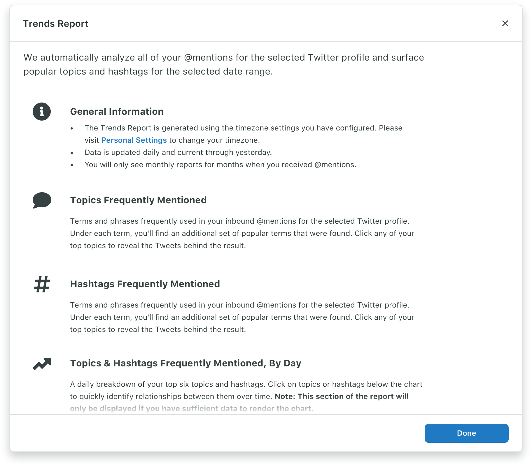
The content we use in a modal is flexible to accommodate a wide range of use cases and needs. We can offer some rough direction on some common elements.
Text
- Text in the body of a modal should almost always be left aligned.
- Except when paired with expressive illustrations or imagery. In this case, we typically text align center.
- Try to keep line lengths to around 15 words or 75% of the width of your window.
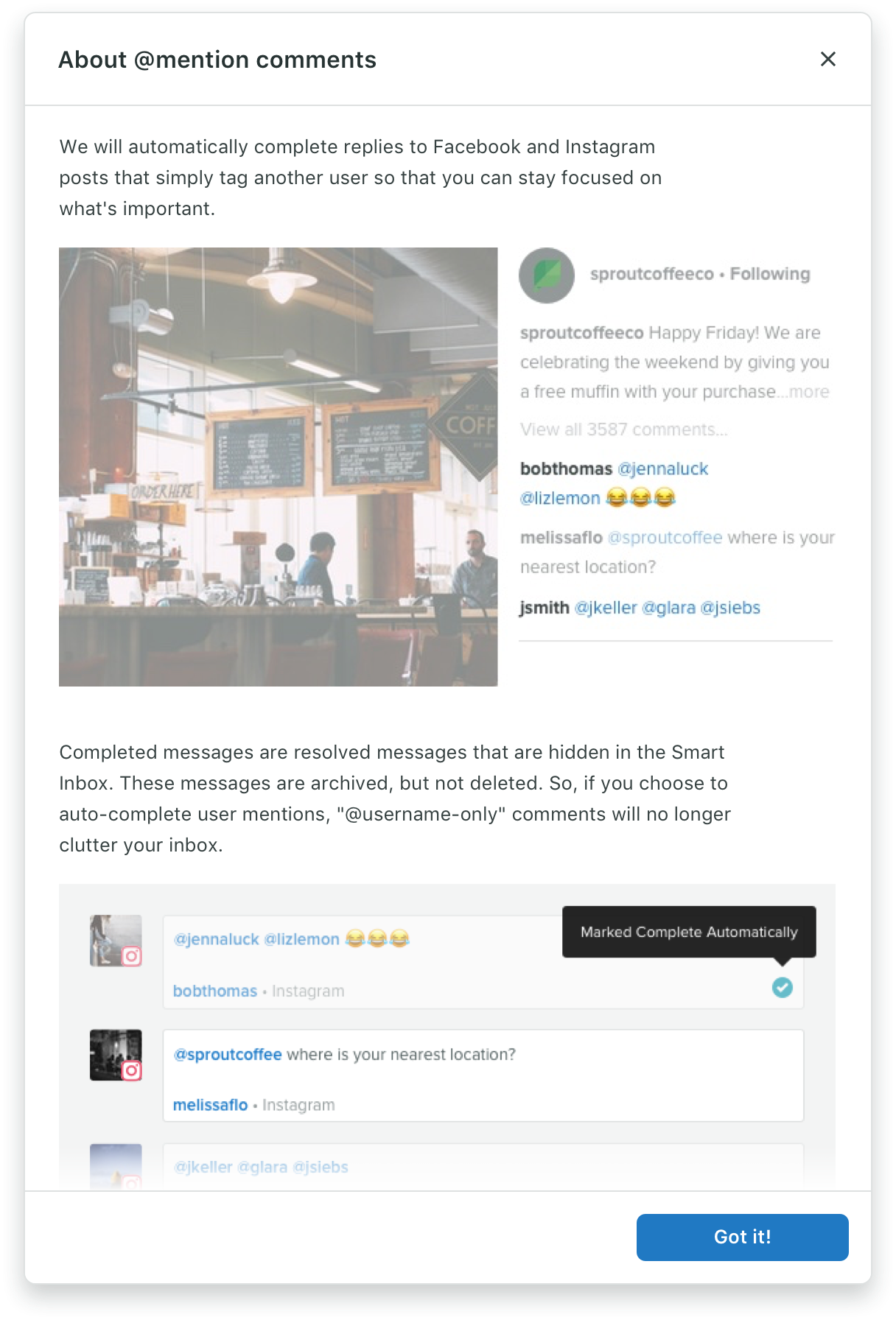
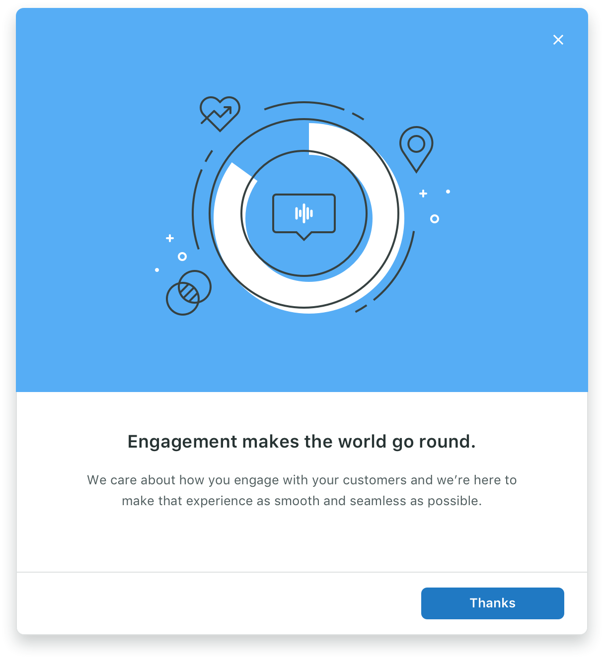
Illustrations and imagery
- Illustrations and imagery can use white backgrounds or full bleed color.
- When pairing illustrations and imagery with text, consider center aligning text in expressive environments.
- If the imagery is being used in a more productive, supportive, long-form role where legibility is the primary concern, left aligned text can be used.
Forms
Using a form in a modal follows all the same principles as using a form anywhere else. For more detailed information about how to use forms, take a look at our forms documentation.
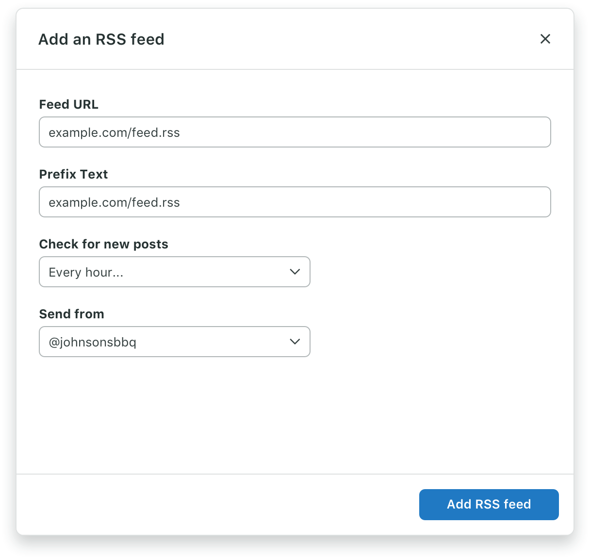
- Forms should be a single column when possible.
- Group related information in a logical sequence.
- Tailor the length of form fields based on the content.
- Use labels to describe form fields.
Modal Footer (V2)
Modal Footer allows us to add actions or informational text to the bottom of a modal. Modal V2 provides a simplified API with automatic button wrapping.
Standard Footer:
Footer with Left Action:
Custom Footer:
For custom footers with informational text or complex layouts, use ModalCustomFooter:
Information
Sometimes it's necessary to provide additional information related to the modal content. Use ModalCustomFooter for this.
Actions
Actions are typically used in Modal Footer when the content of the modal is a linear experience, like a form, and the subsequent action depends on its completion.
| Action | Order (lowest to highest, right to left) |
|---|---|
| Primary | 1 |
| Secondary | 2 |
| Cancel (text) | 3 |
Note: Buttons passed to ModalFooter automatically close the modal when clicked. If you need to prevent this behavior, use ModalCustomFooter with ModalCloseWrapper only where needed.
Best Practices
- An action taken from a modal should not open another subsequent modal
- Since a modal draws the user's attention from other tasks and requires an action to be taken in order to close it, consider the user and necessity of the modal.